sebastian mitchell
Wavetable, the newest synthesiser in Ableton Live, has been extremely popular since its launch.
I use Wavetable a lot in my own productions, and have really enjoyed the speed and flexibility it lends to the sound design process.
I’ve also seen a lot of areas where things could be slightly improved. I wanted to redesign Wavetable (unoficially) to explore how its usability and power could be enhanced even further.
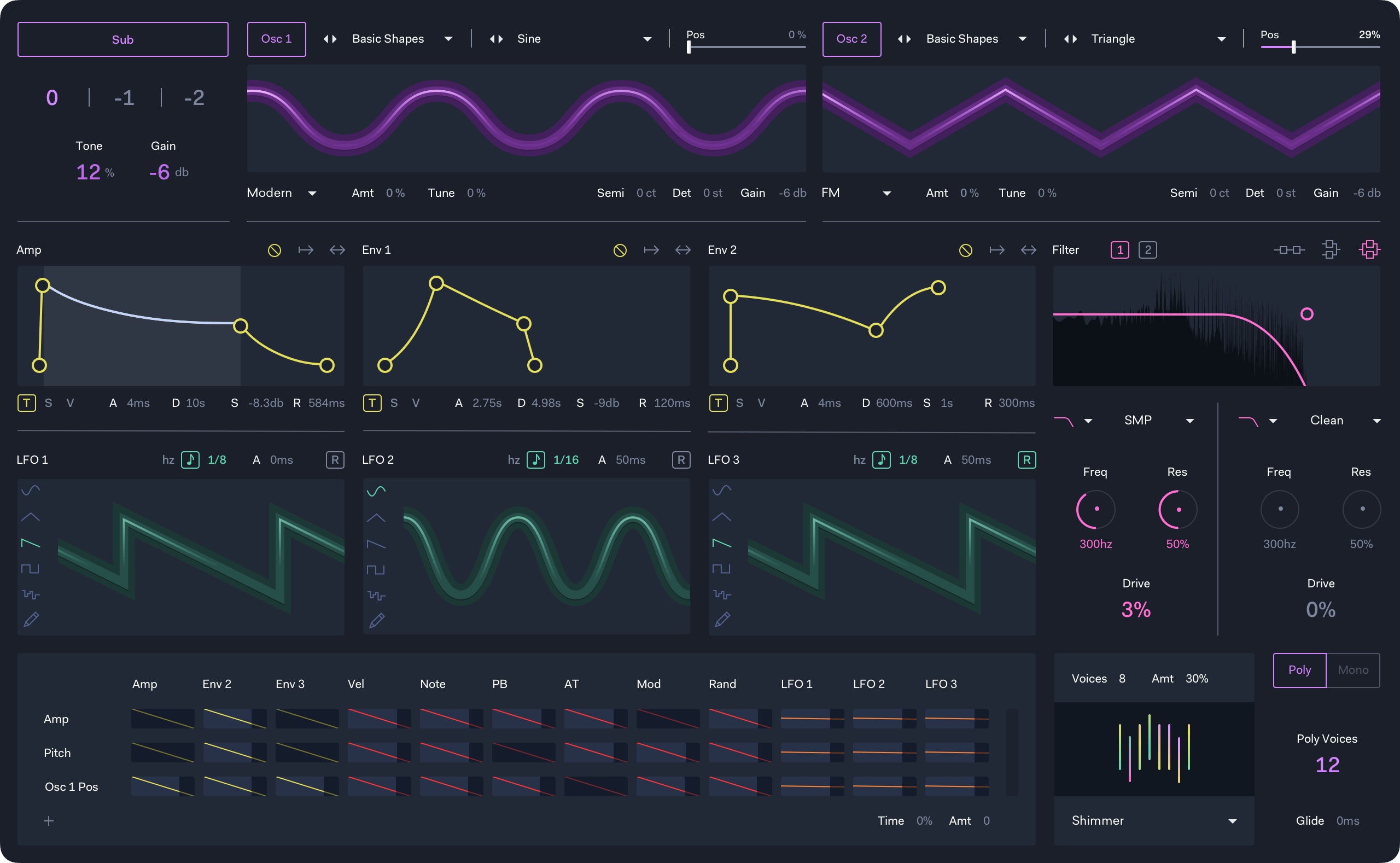
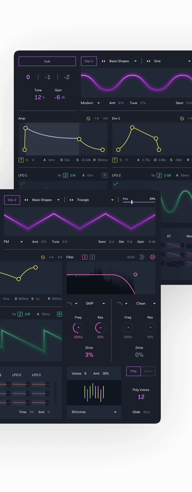
Ableton’s UI language is pragmatic and versatile, but is currently spread very thinly across dozens of instruments and effects - often underperforming. I wanted to update the visual style, and fix a number of small usability issues.
In particular. the wavetable visualiser suffered from being overly complex - many different positions in the wavetable are shown together, and it's often difficult to make sense of what's going on.
I also ran a short survey asking for ideas, which I posted to various music production communities. Improvements to the mod matrix, an additional LFO, and various other small changes were suggested.
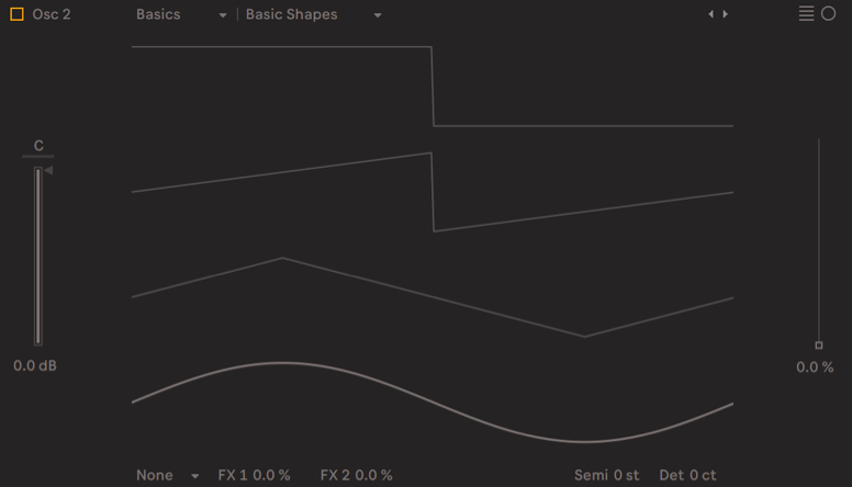
Although illustrative of how various wavetable positions appear, the wavetable visualiser isn’t very helpful when it comes to programming sounds.
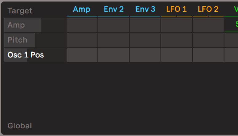
Many users find the Mod Matrix confusing at first.
Space isn’t used effectively, and elements don’t obey basic usability principles (e.g. the arrows to change wavetable are far from the wavetable names).
Nearly everyone who answered the survey said that Wavetable’s modulation matrix was both the synth’s best feature and the hardest one to learn.
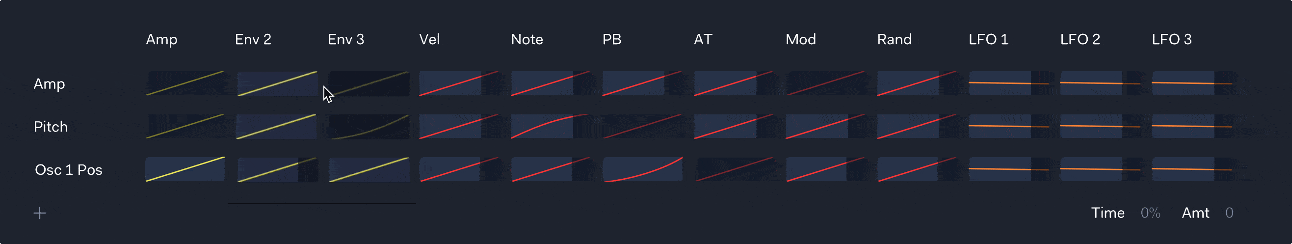
There were a few basic things I wanted to tackle first. A parameter only appears in the mod matrix when you click on it in the interface, which is slightly confusing. I added a button below the matrix to show new users that they can map parameters.
I also wanted to allow users not only to control the amount of modulation, but the modulation curve. I thought of a simple way to do this quickly, by allowing users to drag vertically.
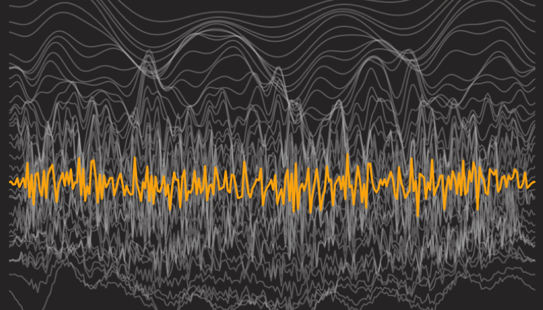
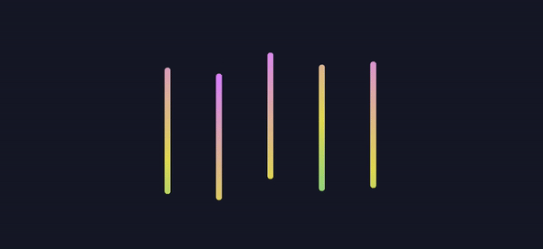
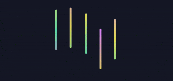
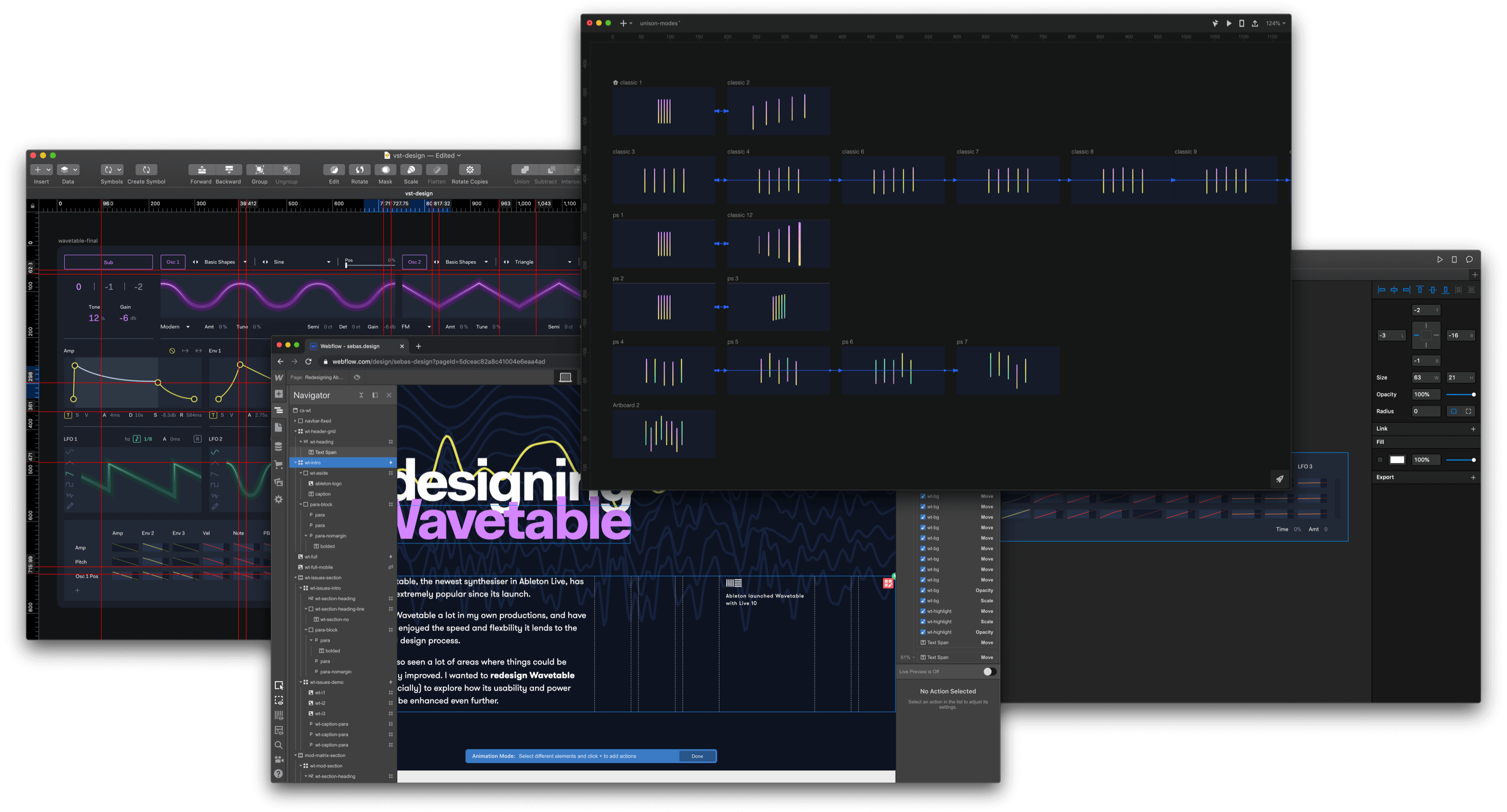
Wavetable’s unison modes are one of my favourite parts of the synth. I wanted to visualise them as I felt this would give users a better insight into what’s happening with their sounds.
I visualised each line as a voice, and the distance between them represents the stereo panning. Differences in pitch are showne through vertical alignment, oscillator position is shown by gradient/color, and phase is shown by size.
Classic

Shimmer
Noise
Phase Sync
Position Spread

Random
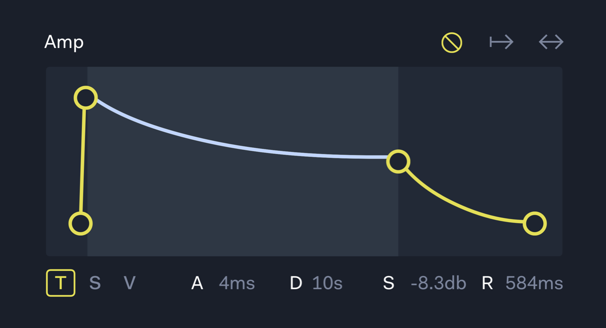
Envelopes
Users can hover over the Attack, decay and sustain parts of an envelope and click/drag to modify the curve. I increased the size of the drag handles to improve users' accuracy.
Filter
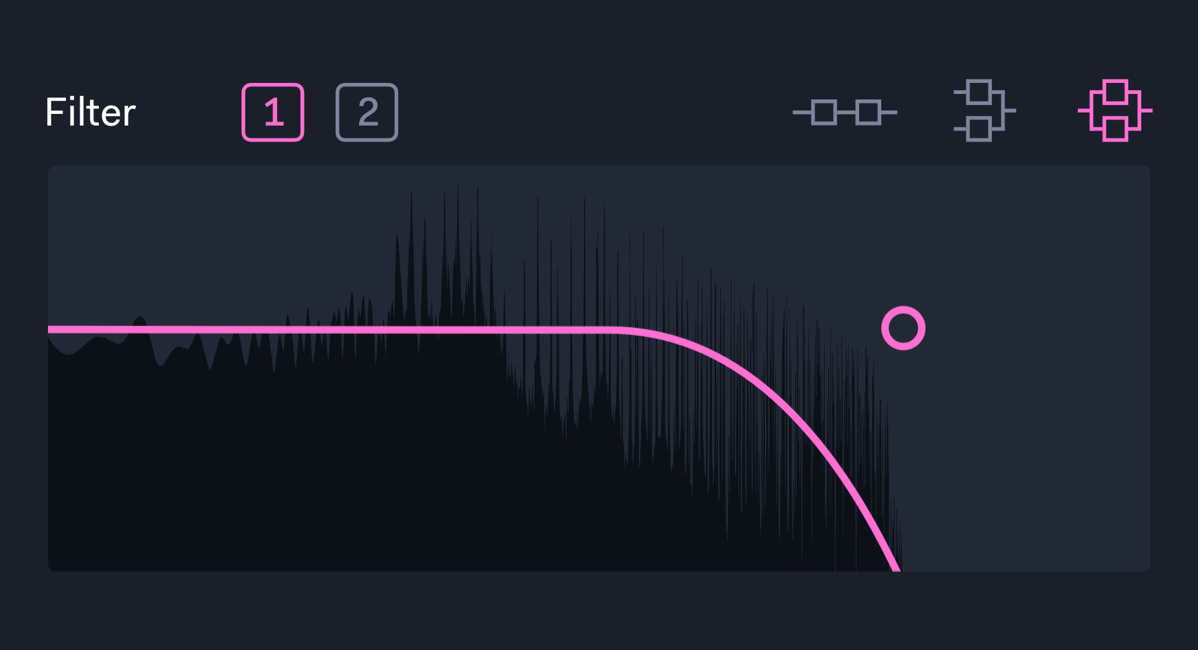
The filter panel shows the filter's effect on the waveform.
LFOs
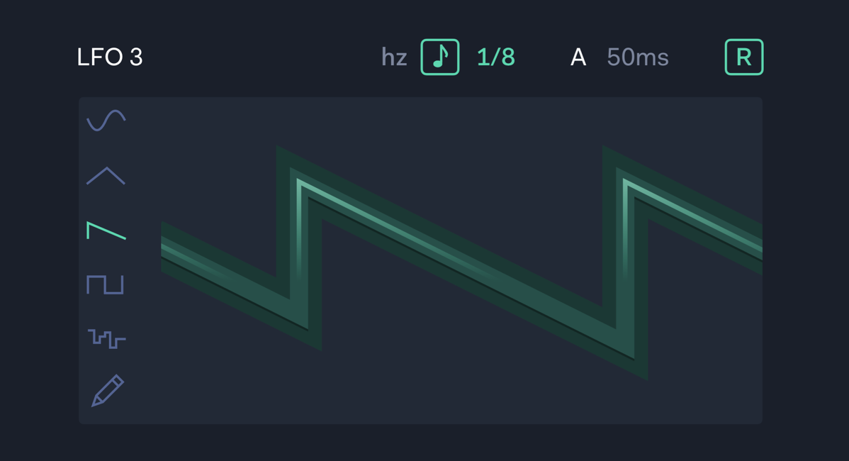
I added a third LFO by making better use of available space, and a button to add a custom LFO shape.
I’m currently available for new music tech design projects - get in touch to work with me.


