Doctaroo
Doctoroo is a mobile app which aims to help people find medical care more quickly and seamlessly. It allows patients to book appointments with doctors, and doctors to manage their schedules and income.
Service
I completely redesigned two applications (one for doctors and one for patients), improving the usability and visual design and making the booking process fast, easy, and intuitive.
Deliverables
Personas and user stories, user flow diagrams, conceptual wireframes, a prototype app, usability test results, and a clean and modern visual design.
The rise of telemedicine
With the market for telemedicine expected to grow quickly in the coming years, patients and doctors are opening up to the concept of remote treatment.
The team behind Doctaroo aim to be a part of this growth by creating an easier and faster way for patients to interact with doctors. The company was invited to join the prestigious Station F accelerator group in Paris (the largest such organisation in the world).
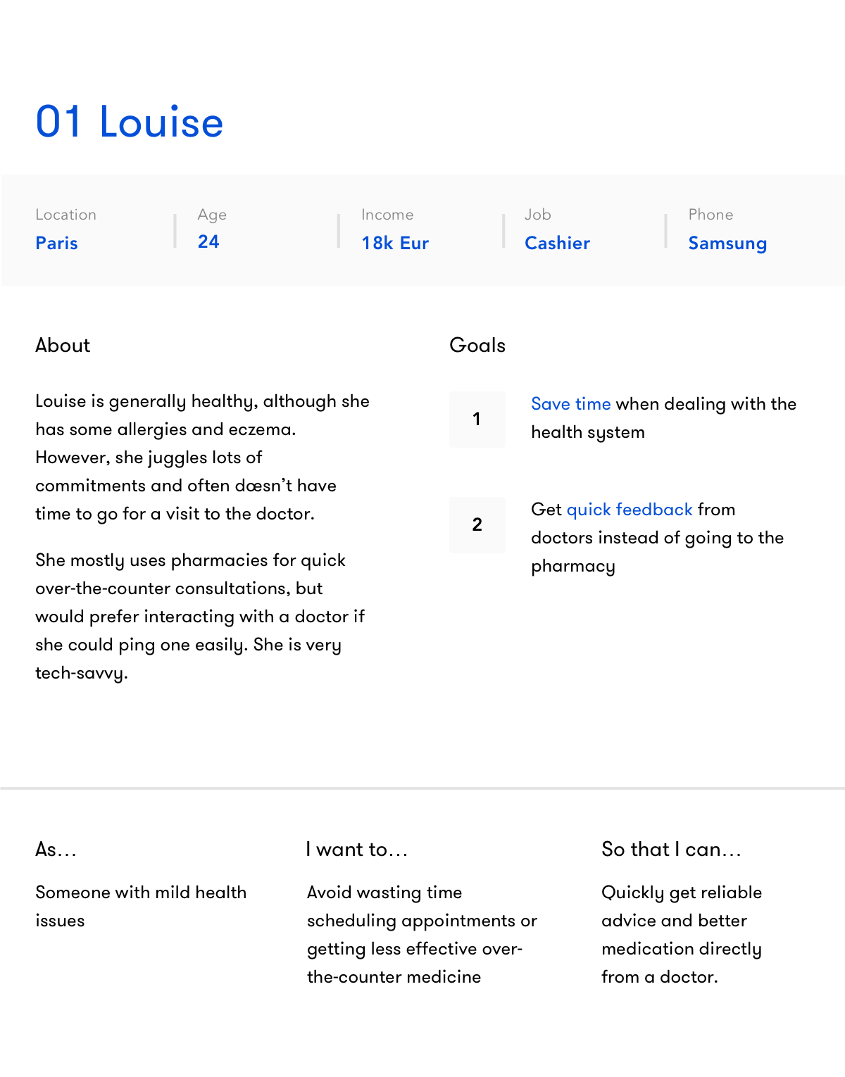
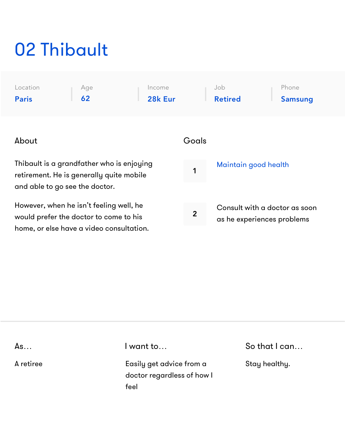
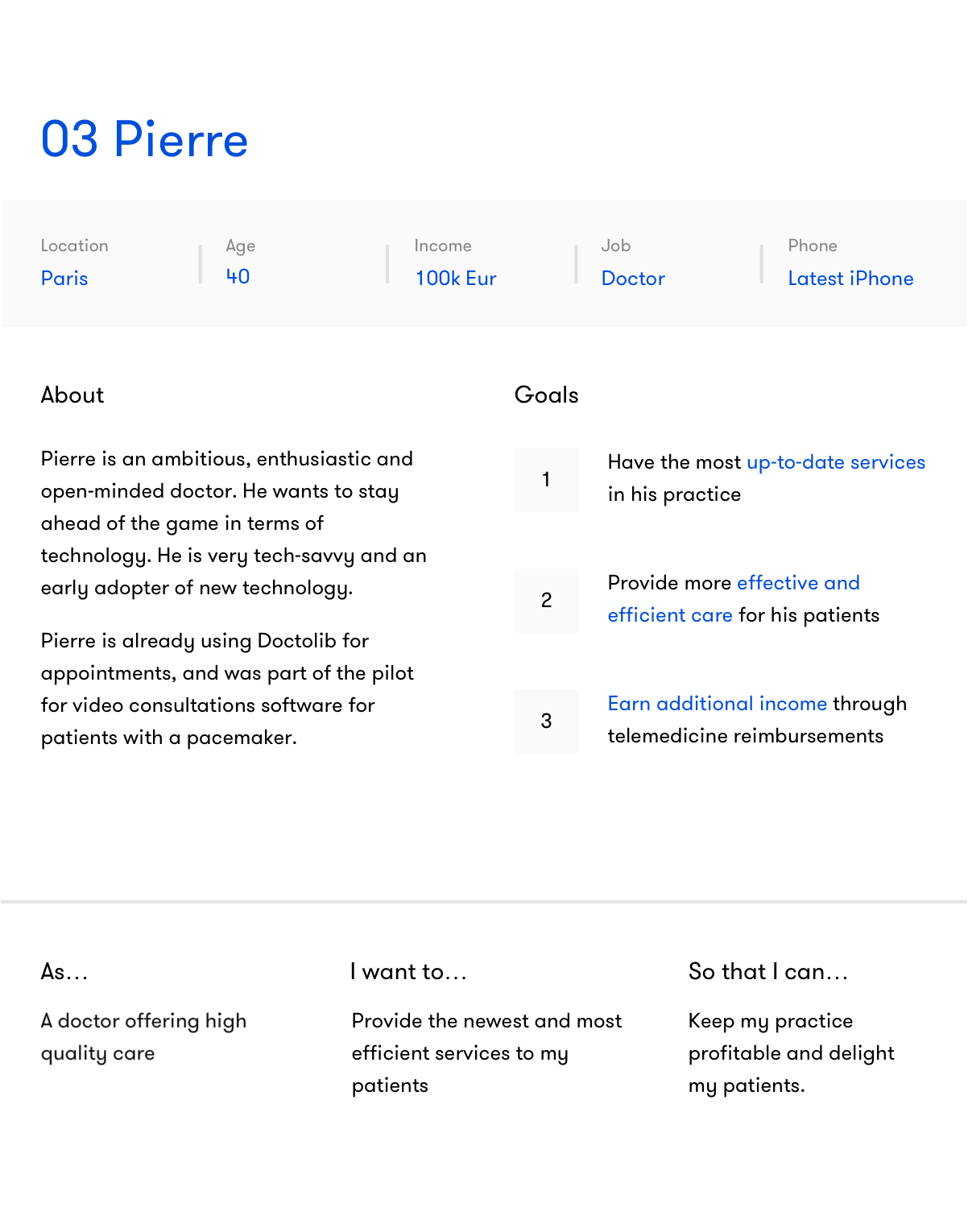
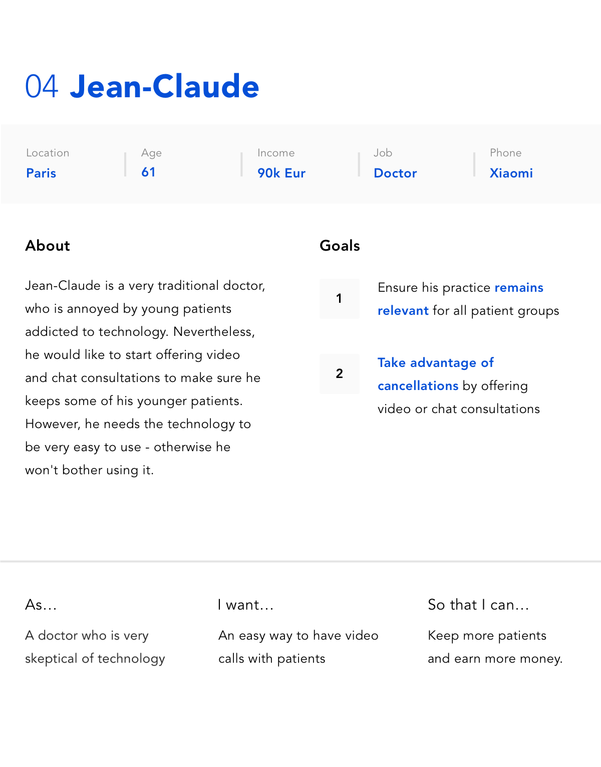
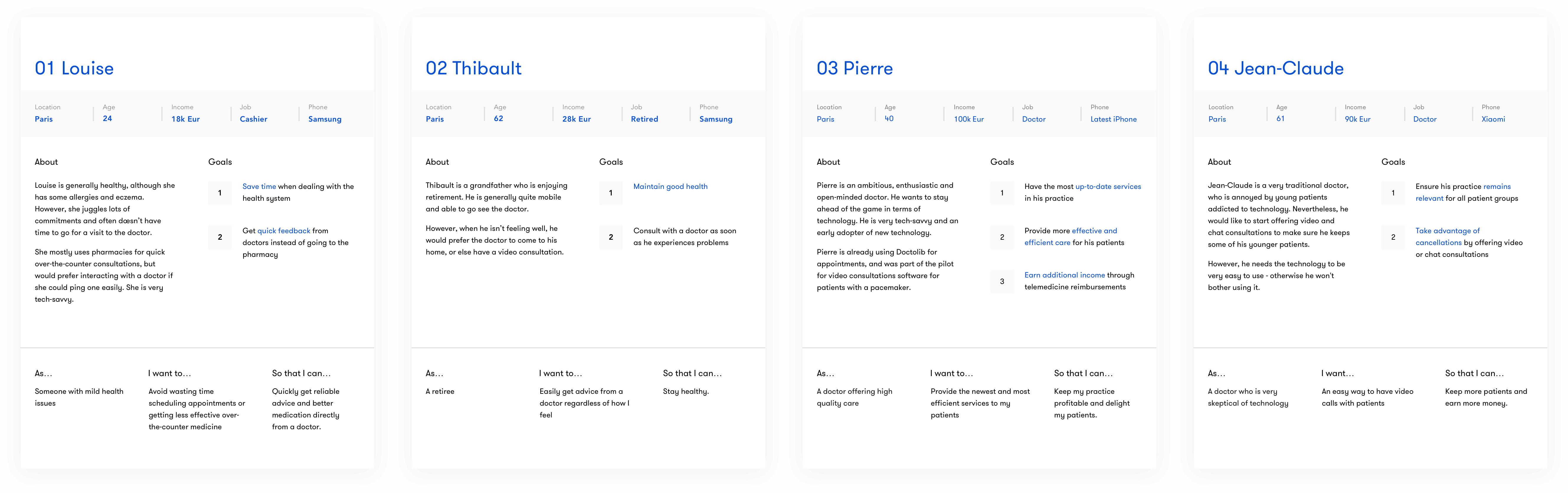
Defining our users
The original list of user personas was too broad, so I narrowed it down to two patients and two doctors. I wanted to get this stage very clearly defined to ensure that we would have a guide for weighing future design decisions against - this was important for an app for which the target audience could potentially be the entire population.
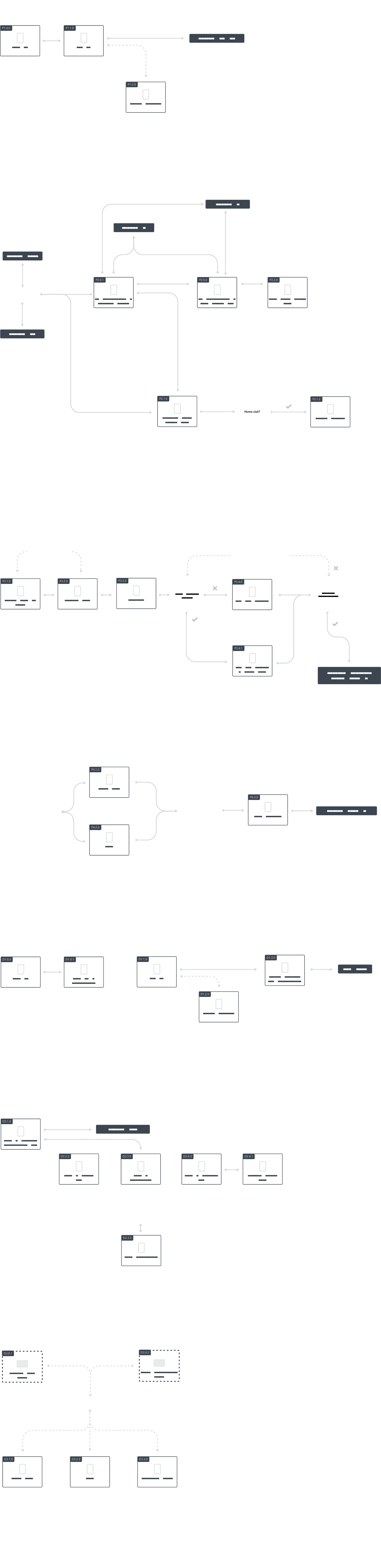
Architecting the app
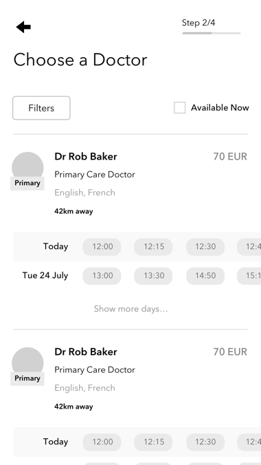
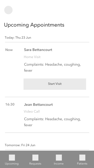
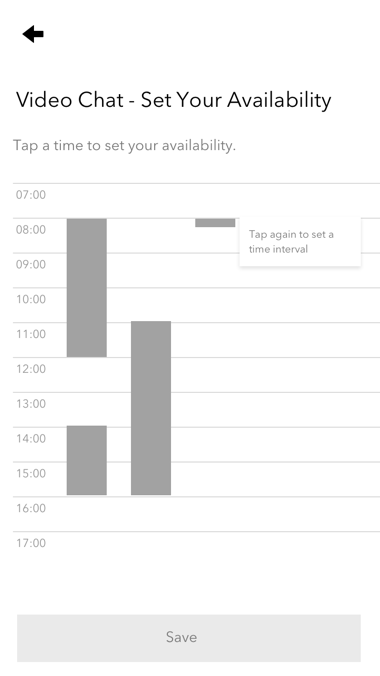
I thought about the way people typically book appointments - they are generally flexible. Someone would think: “I’m free between 2 and 4, and if it’s a good doctor I could maybe cancel my appointment at 5 and see the doctor instead”, and so on. I decided to make the booking process reflect that.
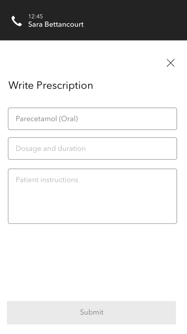
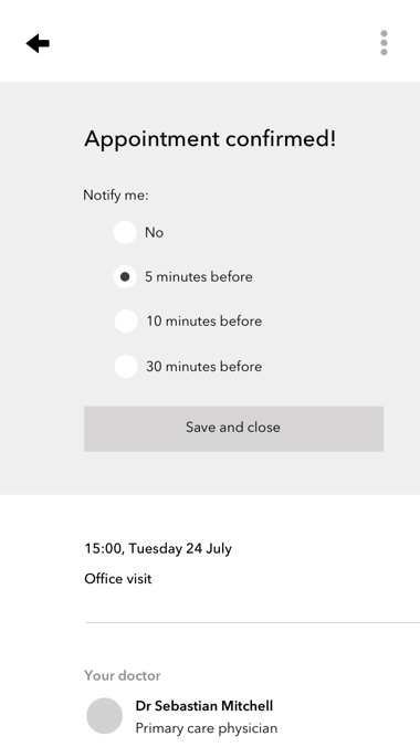
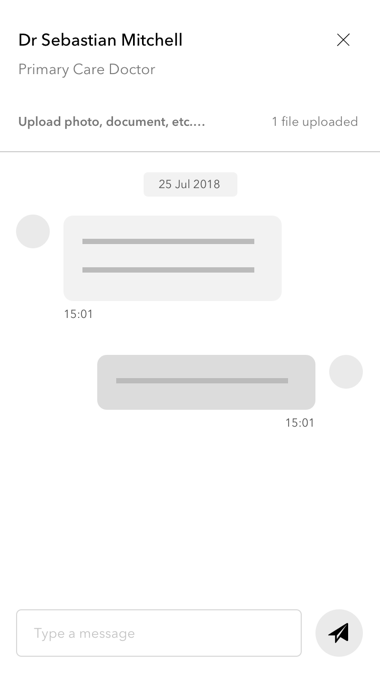
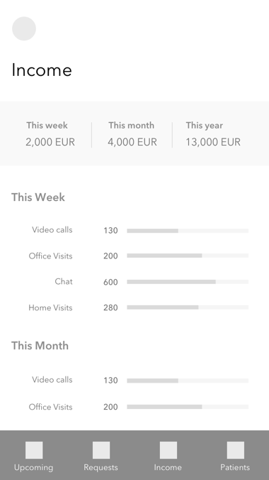
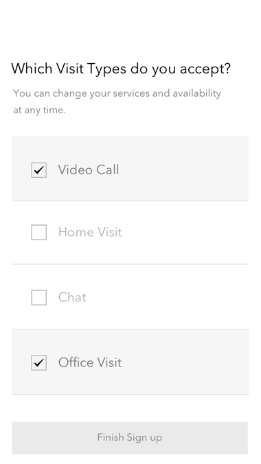
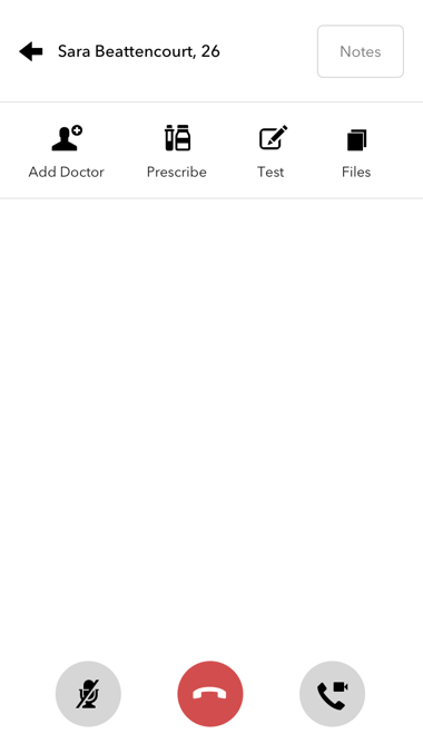
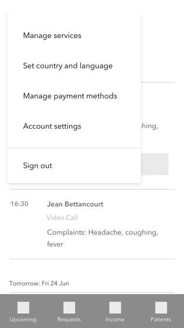
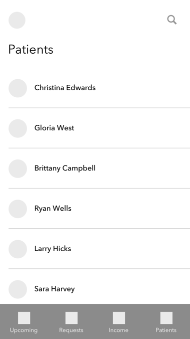
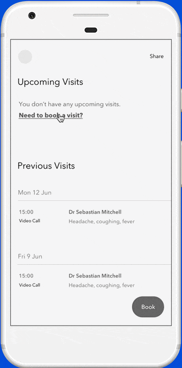
I wanted the hub of the app to revolve around booking an appointment. This was the primary feature of the product (and the business) - I wanted to make sure the core offering was clear.
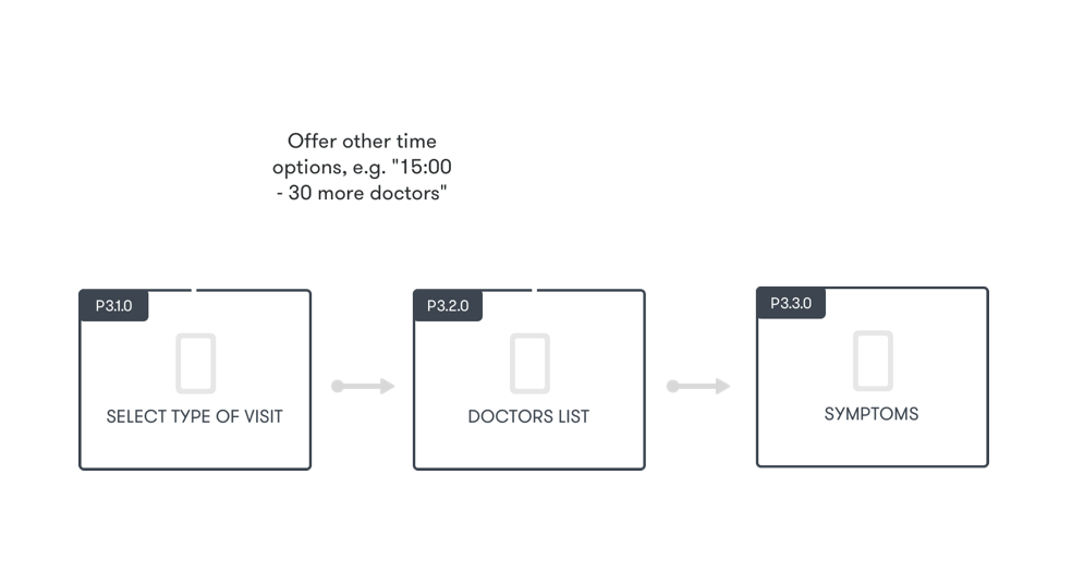
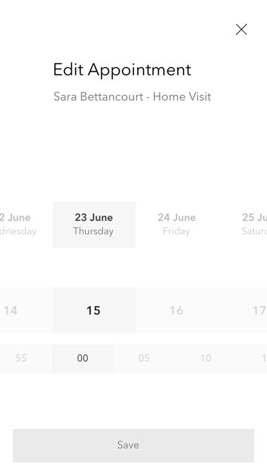
I spent a while deciding on the best way forward for the booking flow. At first, we leaned more towards allowing users to select a specific time first and seeing the doctors that were available then. I advocated for changing that, as I decided it was more important for users to find the right doctor using appropriate filters.
For example, if a user selected a time but the right doctor wasn’t available, they would have to go a step back in the process, something I thought it was very important to avoid.
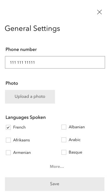
Starting the UI
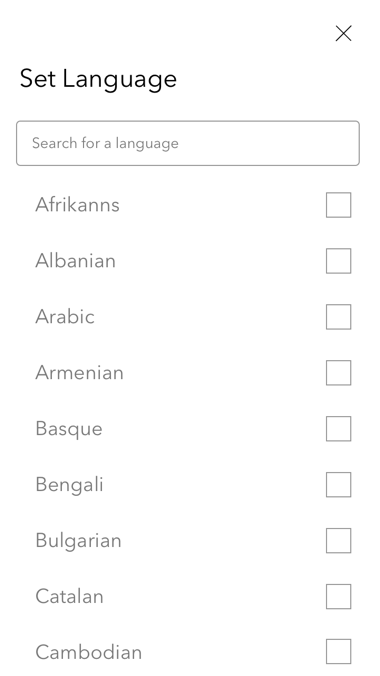
Using the structure of the user flows, I designed the first wireframes of the app. It was a challenge designing two apps at once - especially considering the different target user groups.
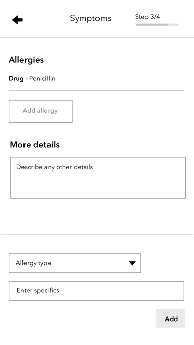
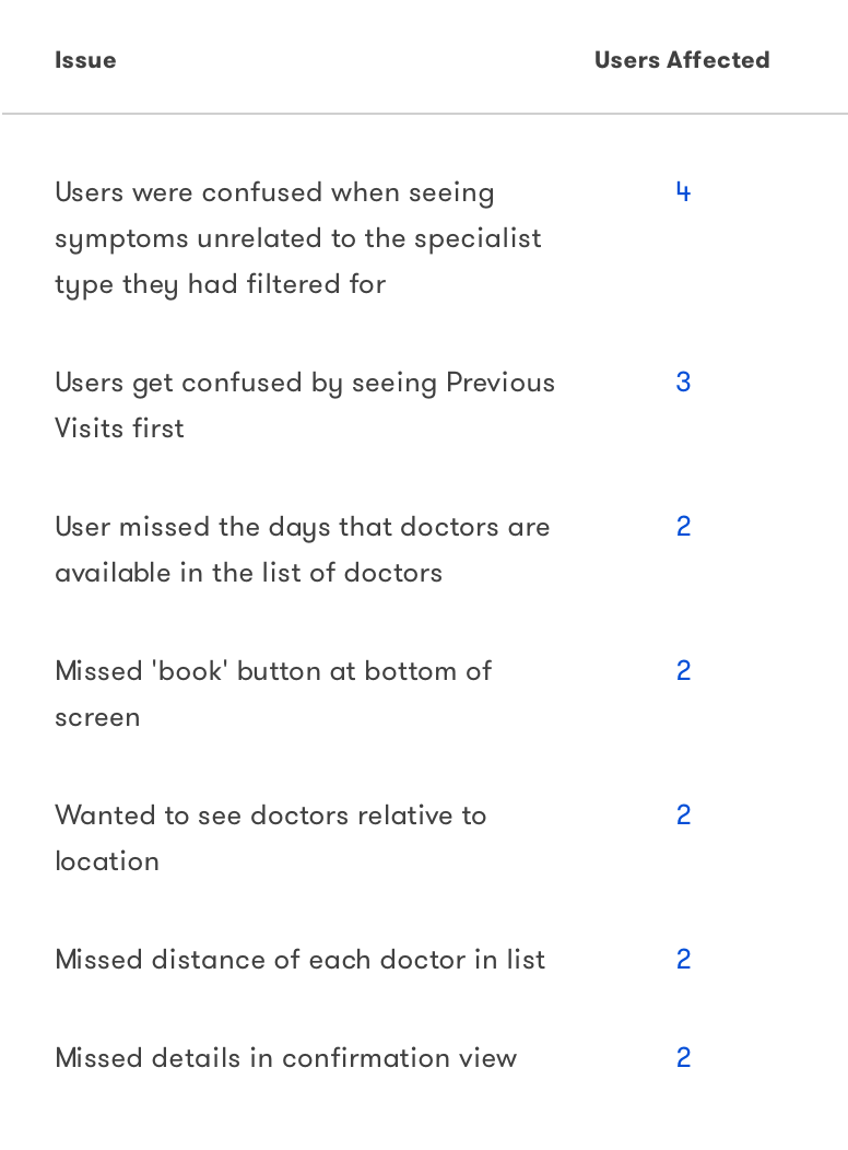
I also built a prototype of the booking flow and tested it with users. Most of my assumptions were confirmed, and I learned that users thought it would be better to show only symptoms related to the filters they had selected.
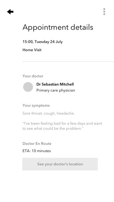
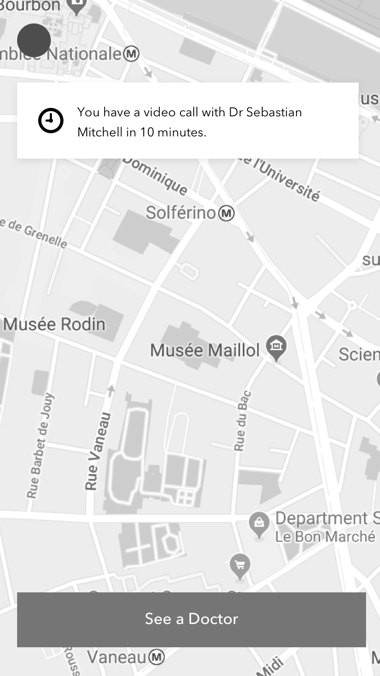
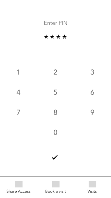
I also noticed that users got confused by the home screen, which I decided to simplify down to just a map and a "Book Now" button.
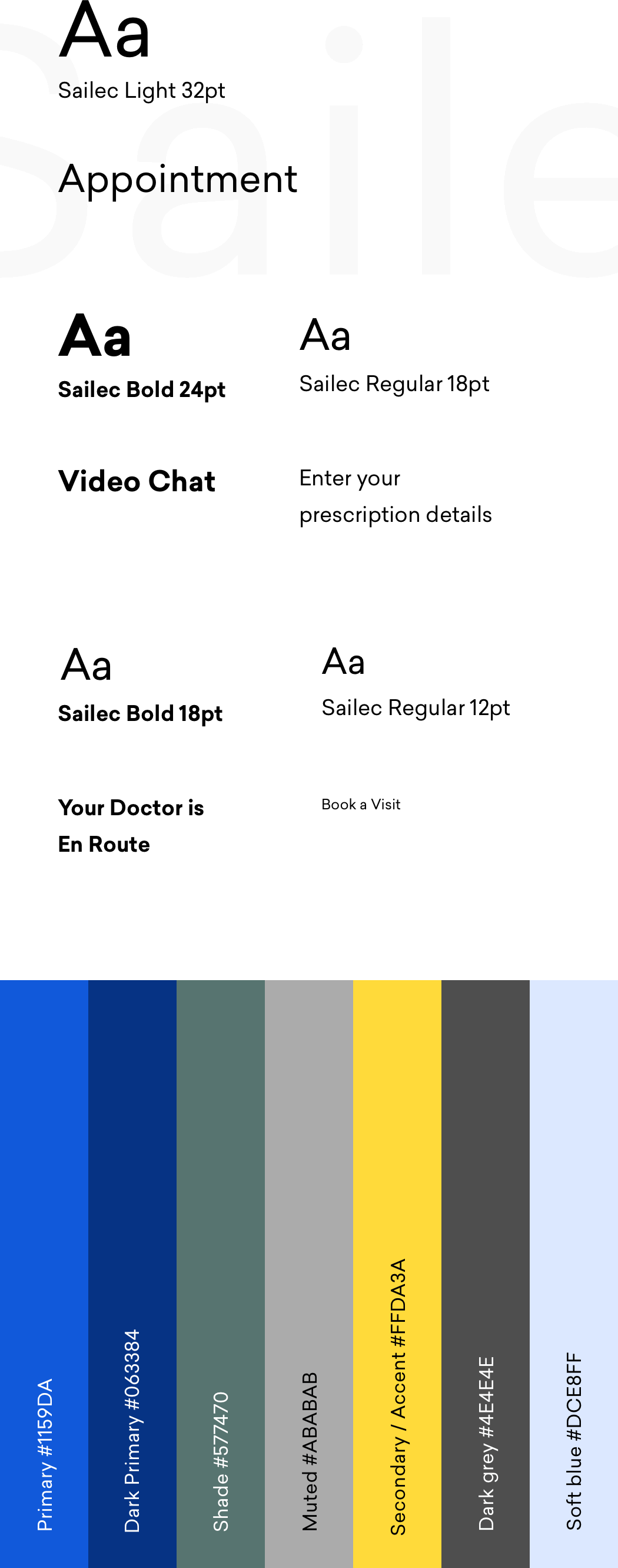
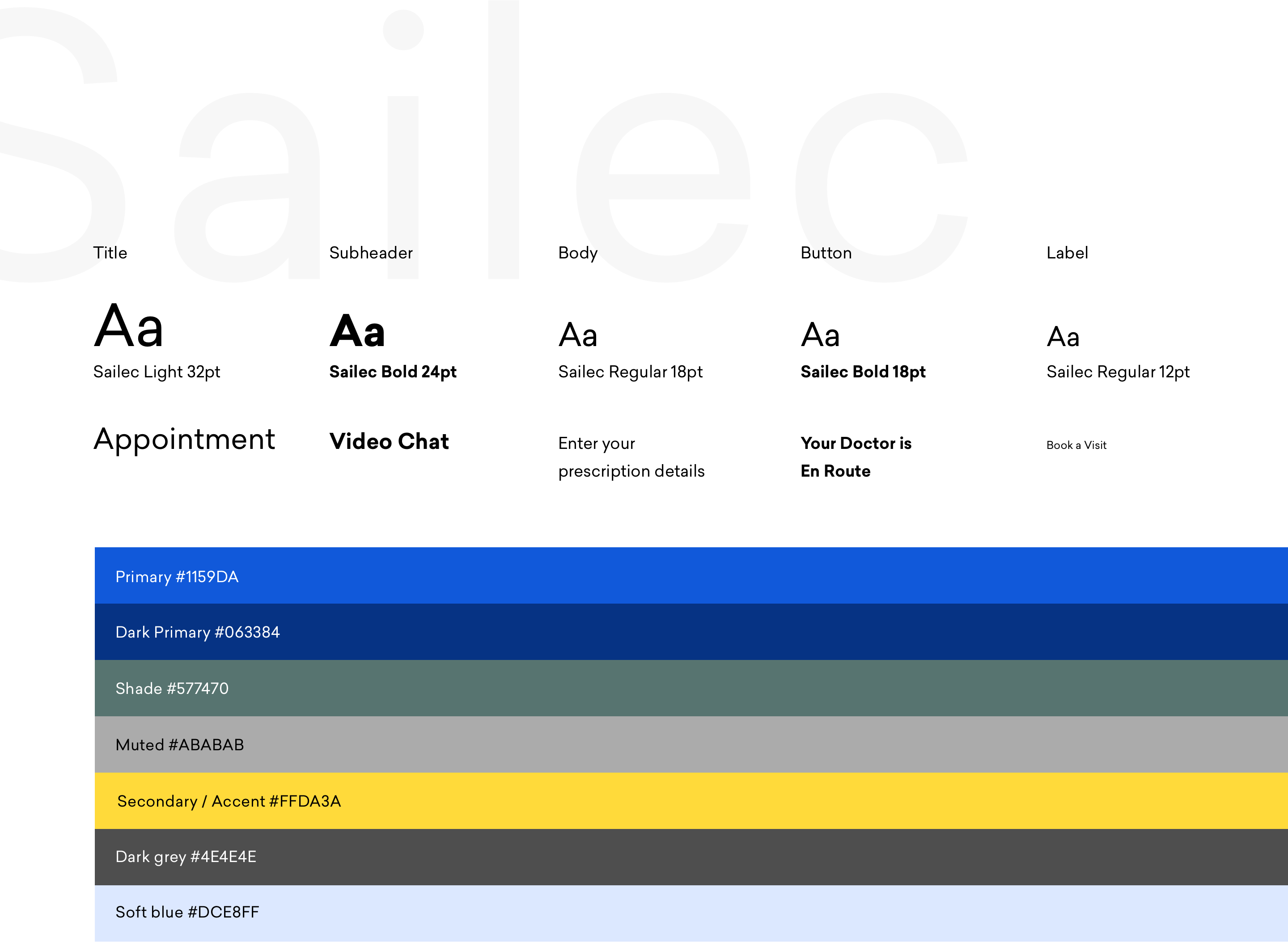
I decided to go with a a calming, professional feeling, as users were likely to be feeling sick or uncomfortable using the app and it would be better to reassure them. I chose a strong blue color to convey knowledge, trustworthiness, reliability, and confidence. I also made the colour relatively bright and saturated to evoke a sense of freshness and modernity.
I wanted to use a neutral, friendly font as well, and after experimenting ended up choosing Sailec for its clarity and easy readability.
Visual design
Working with Nokia, I redesigned a tool relied on by NGOs worldwide to gather and analyse data.
UX & Visual Design
Humanitarian software
Redesigning a platform used by organisations like Harvard University to connect their employees.
UX & Visual Design
Web/Mobile Enterprise Software