Nokia Data Gathering
Nokia Data Gathering is a survey and analysis tool for web and mobile, used by international NGOs (including the UN and World Vision) to monitor complex field projects.
Nokia Data Gathering is a survey and analysis tool for web and mobile, used by international NGOs (including the UN and World Vision) to monitor complex field projects.
I conducted UX research, redesigned the entire UI, and simplified many interactions to improve usability and learnability.
I provided a usability evaluation and all the assets the developers required for the redesign.
The redesign was successfully launched for organisations in over 20 countries, and led to an increase in usabillity (especially for users with low literacy levels).
Nokia Data gathering allows users to create and deploy mobile surveys, manage field workers, and view and analyse results through a web interface.
It has been used variously to help reduce the risk of drought in Uganda, cut Dengue fever outbreaks by 93% in northern Brazil, and to increase birth registration rates in Kenya from 30% to 68%.
After reviewing the system, I made some observations of potential usability problems. However, because the tool was already deployed and being used by thousands of people, feedback from actual users was critical.
I traveled to Manila for a workshop organised by Nokia, where I conducted interviews with key users.
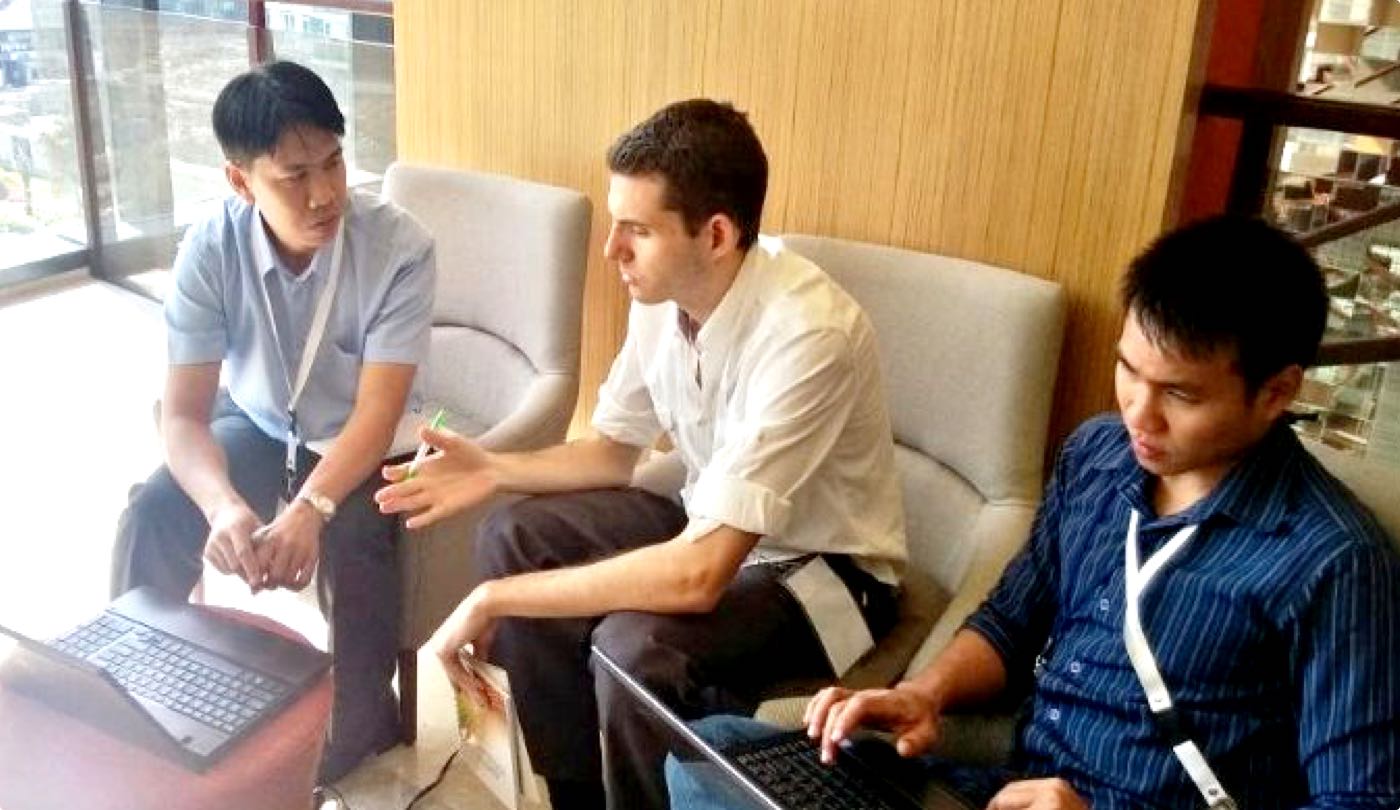
The research backed up my earlier thoughts - creating surveys was complicated and confusing, and analysing data to understand what was happening on the ground was cumbersome.
Many NGOs using the tool also noticed that their data collectors were making mistakes when completing survey, which required a lot of time-wasting data cleaning.
I set to work on improving the survey builder and data analysis features. I focused on simplifying the existing interface, stripping out unnecessary elements and designing easy drag-and-drop interactions to help users quickly build what they needed.
I also convinced the developers that data entry controls needed to be added, so that survey builders could restrict the types of data that could be entered - thereby reducing mistakes.
Collecting data correctly is half the story - analysing what's been gathered is critical for decision-makers. From the interviews I learned that most users just need a simple snapshot of how their survey has been completed.
More complicated analysis always took place in external tools. I decided to keep the visualisation tools extremely basic - a map view and two types of chart.
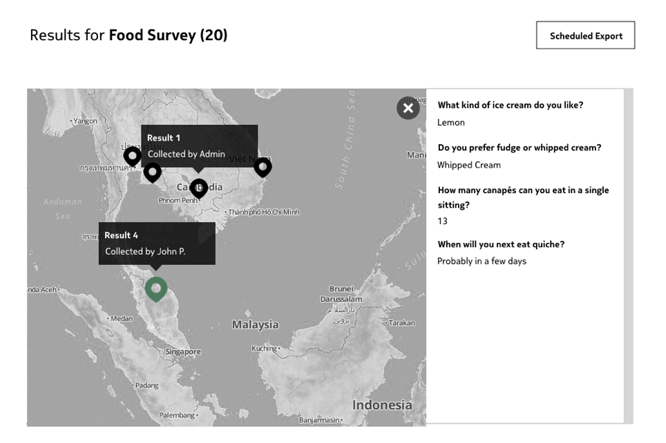
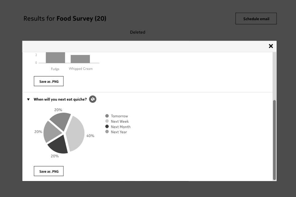
During the multi-day workshop in Manila, I created quick wireframes and got several rounds of feedback from key users and stakeholders. I decided to do this in order to save time - I could get insights from 20 users from 10 countries in 3 days, something which may have taken me weeks of travel or scheduling calls.
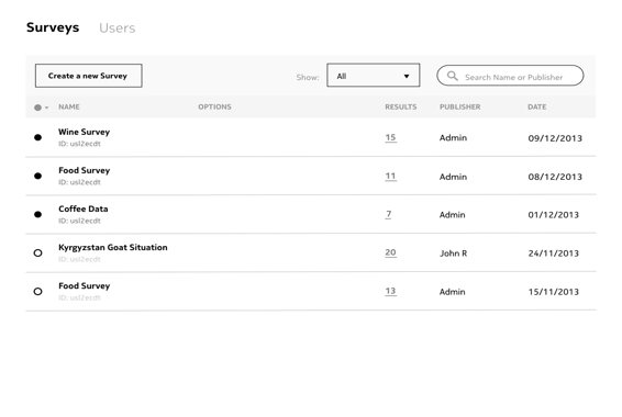
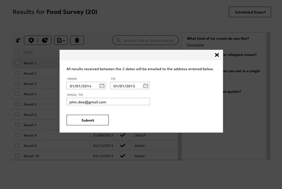
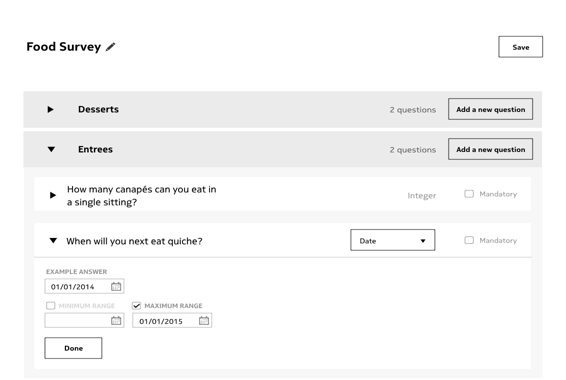
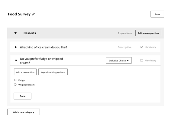
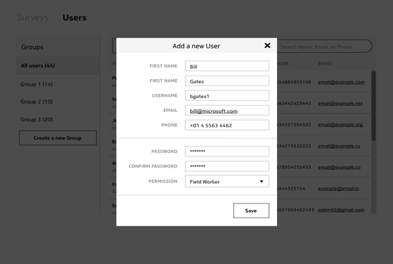
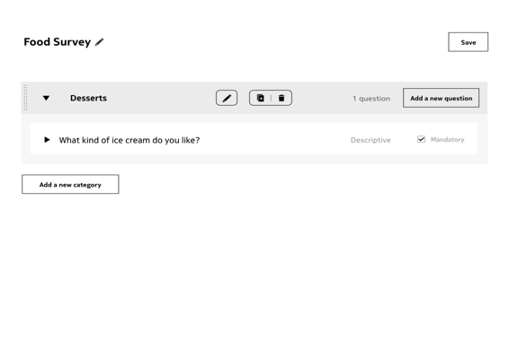
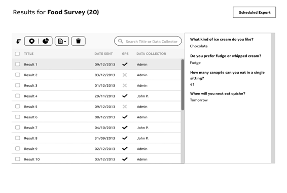
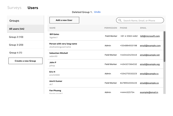
The interface needed to be pragmatic, visually clean, and focus on interactivity to make data management more intuitive. I chose a muted blue color based on the Nokia blue, and we used Nokia Pure as the font.
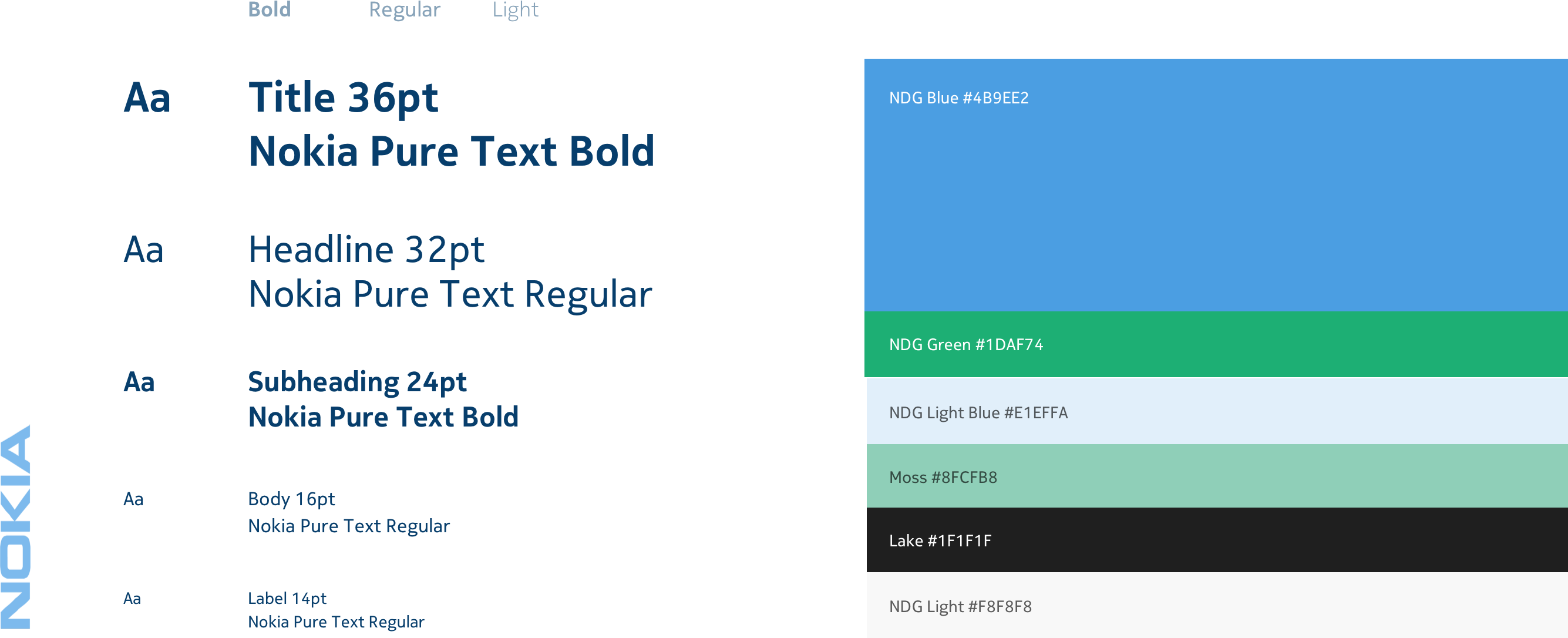
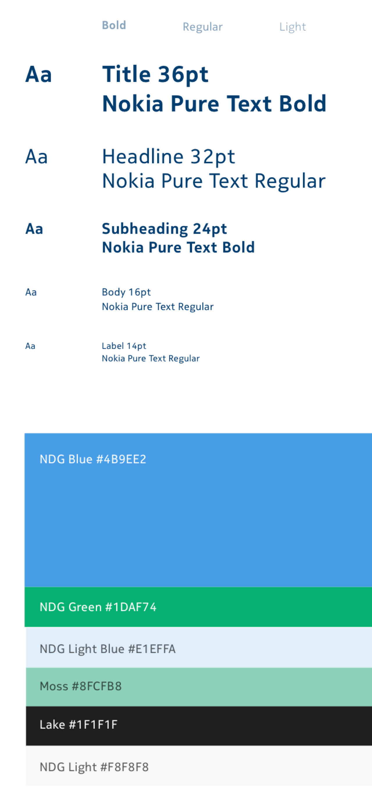
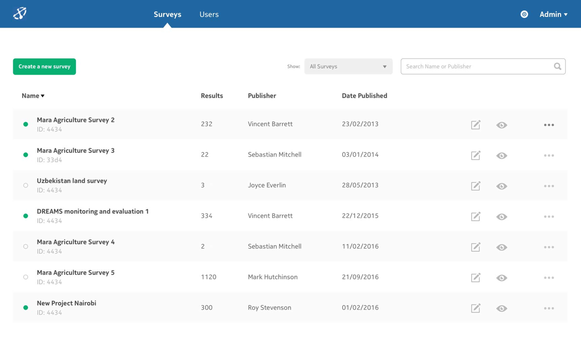


After being implemented, my redesigns significantly improved the user experience for new data managers by improving learnability and ease of use.
Looking back, I would have conducted more usability tests with prototypes, and also have created a style guide to help the developers continue building the app.
Nokia Data Gathering was mentioned by the World Bank in a study on mobile monitoring and evaluation for the agriculture and forestry sector, and is still available open source. After Microsoft’s acquisition of Nokia, the tool was rebranded Microsoft Data Gathering.
Redesigning a platform used by organisations like Harvard University to connect their employees.
UX & Visual Design
Web/Mobile Enterprise Software
An app designed to help patients get care in minutes, not days.
UX & Visual Design
Mobile health app