OfficeAccord is an employee communication tool with over 15,000 users in organisations such as Harvard University.
I led an overhaul of OfficeAccord’s interface, improving usability and providing a new visual interface.
I ran usability tests, a usability evaluation, and provided a style guide and a library of updated design assets.
OfficeAccord was able to rapidly close more client deals, and increase active users by 20%.
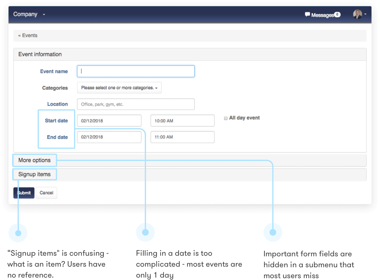
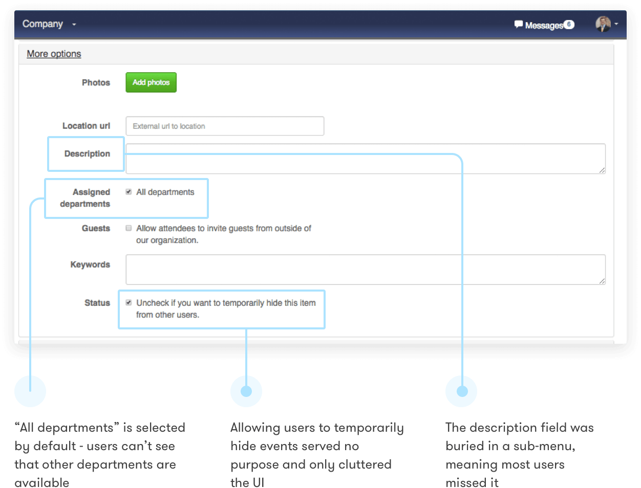
After signing their first few customers, OfficeAccord’s founders realised that users were failing basic tasks and missing important features.
As well as the usability problems, the platform’s visual design didn’t meet the standards their multinational clients expected.
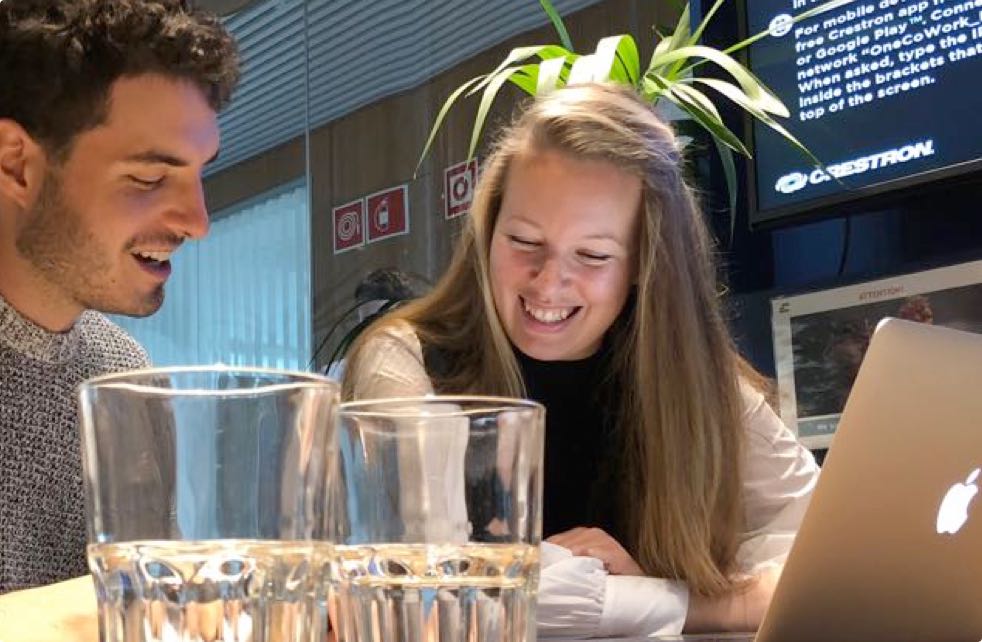
OfficeAccord’s CEO Ben Comstock asked me if I could help out with a redesign. We decided to spend 6 months working together to improve the platform’s design.
Part of my goal was to identify and solve critical usability issues. I sat down with Ben to identify the most important areas of the product to focus on, using the features that current clients were using most as a guide.
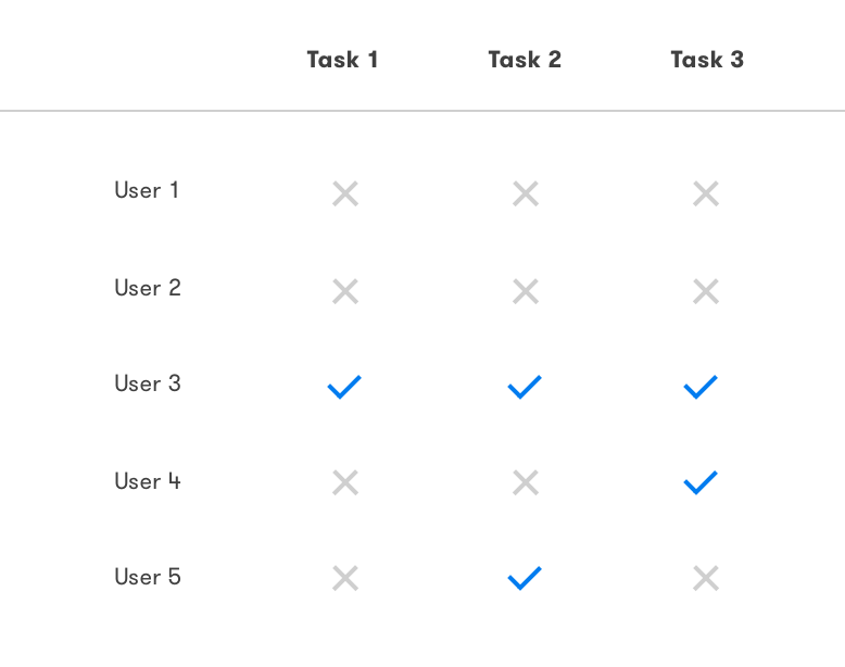
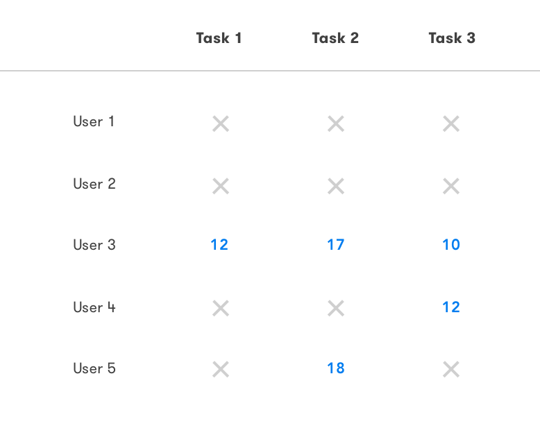
I wrote usability test scripts around important parts of the product, and tested with 5 users. This would be a cheap and effective way of identifying the most salient issues.
The results were worse than I expected - most users completely failed each task, and those that were successful typically took a long time and had to use more clicks than necessary.
"You want to plan a week-long strategy retreat for sales staff later this year. You’d like to get input from all the sales managers on what kind of retreat the sales reps would enjoy most. Create a new conversation for sales managers, and make sure no other employees can see it."
“You’re looking to get feedback on new gym member perk your team recently set up for employees. You want to know how often on average employees go to the gym every week, and whether or not they find the perk useful. Create a new survey to find out the answers."
“Your company has just acquired a competitor, and you’ve been asked to let all the employees know about it. Create a notice stating that the acquisition has been completed and asking employees to keep the information confidential for now. Send it to all employees."
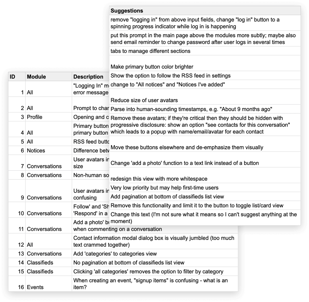
I decided to combine a usability evaluation with the usability testing, to get a better picture of where users would be failing tasks.
Typically usability evaluations benefit from more than 1 evaluator, but I felt that we would catch the most serious problems with the usability testing, and there were enough minor problems I could identify to give us plenty to do.
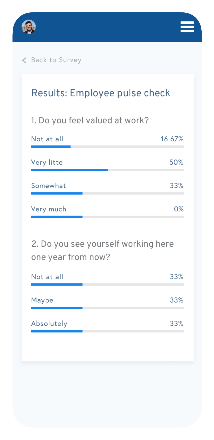
Additionally, I gave each participant the SUS survey after they completed the test, to get a sense of how the platform compared with other software. The score was 74 - an average score, but with room for improvement.
In general I noticed that users thought the system wasn’t that difficult to use, but also lacked confidence when trying to achieve their tasks.
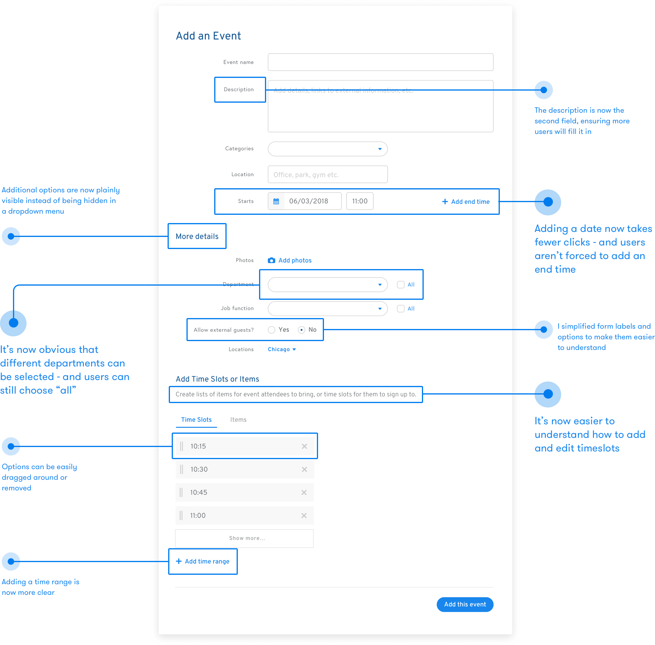
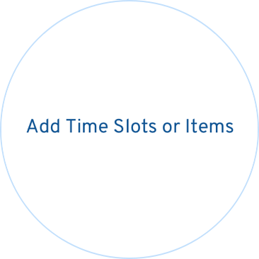
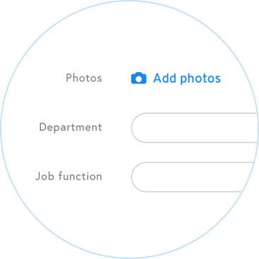
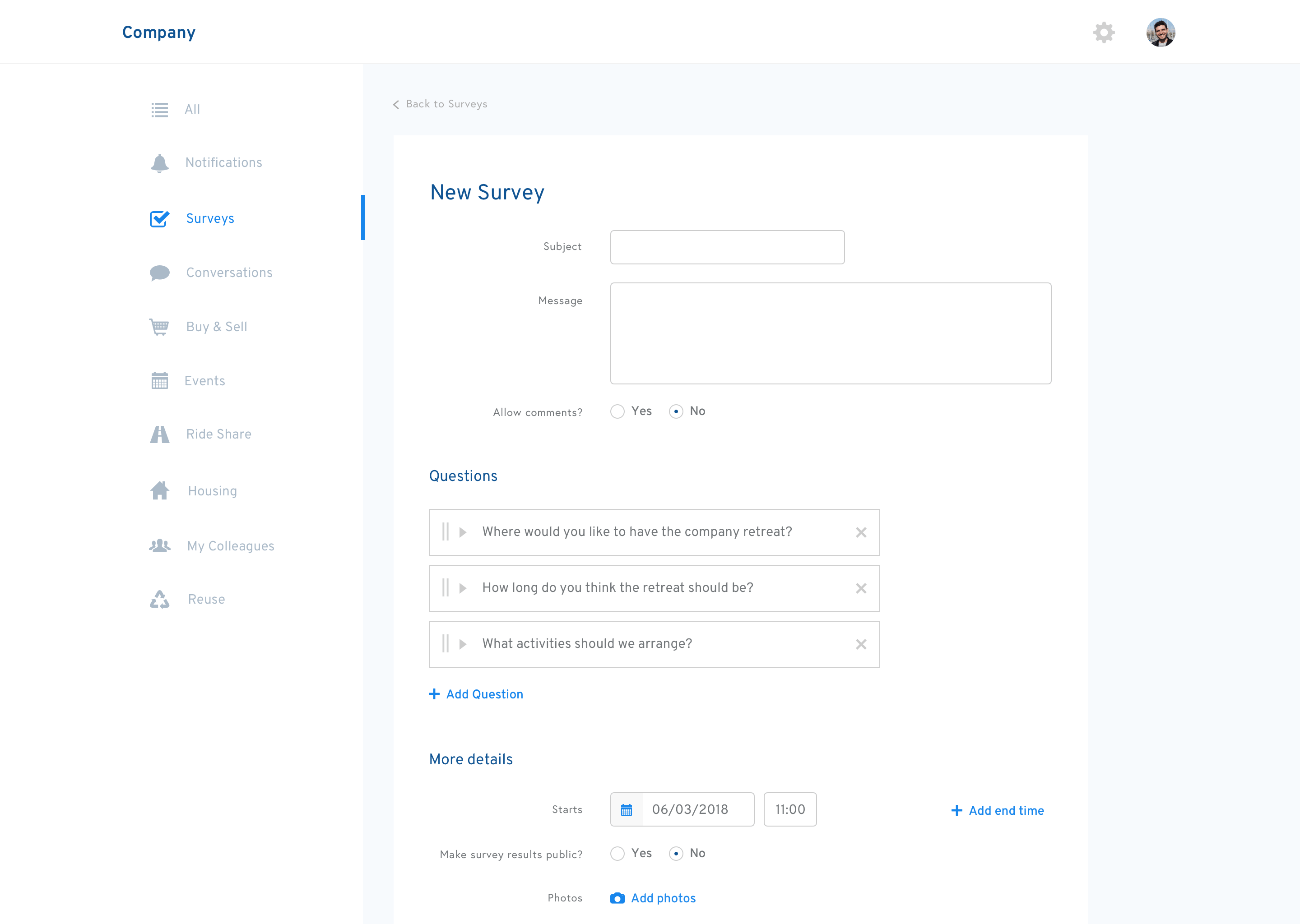
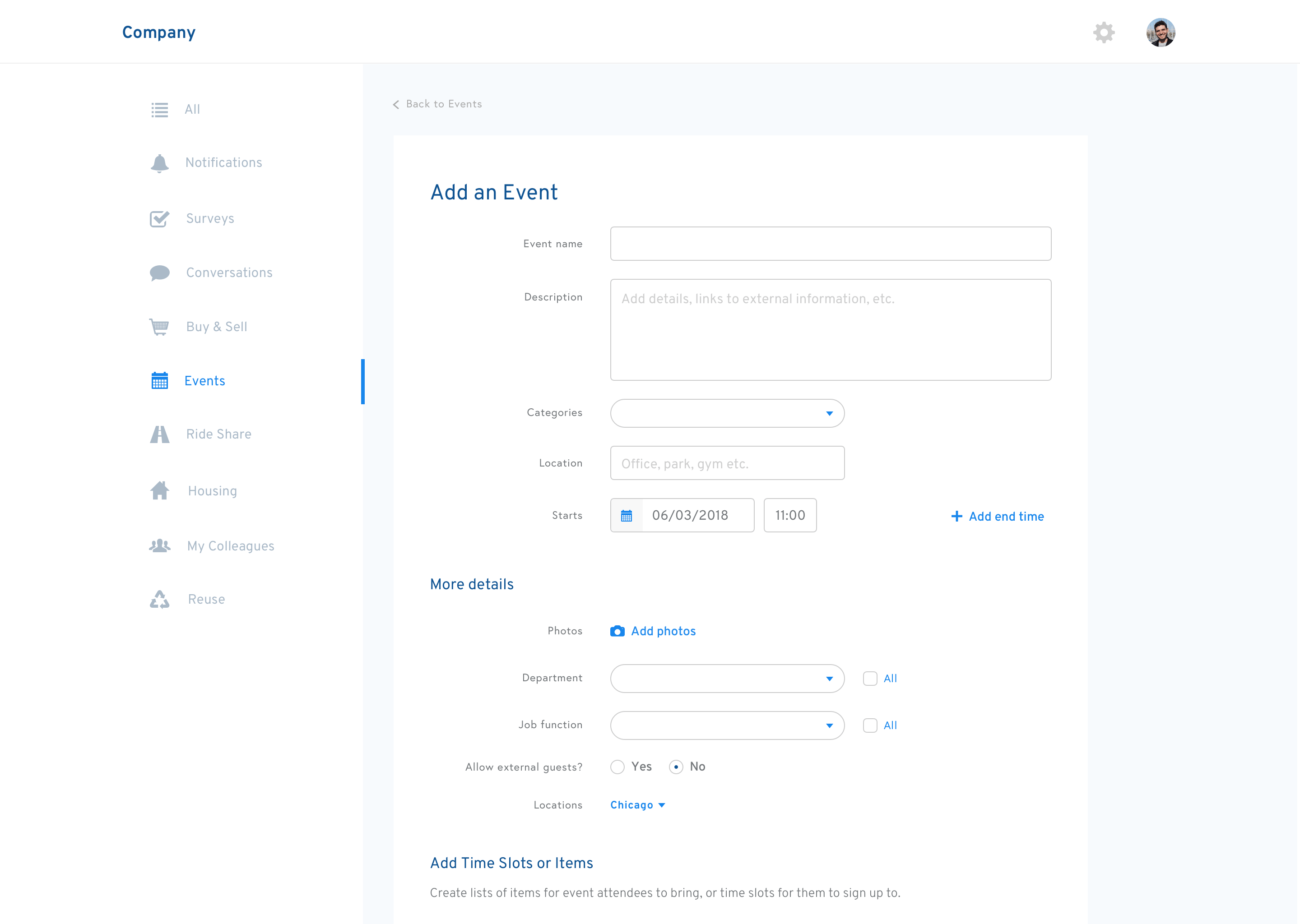
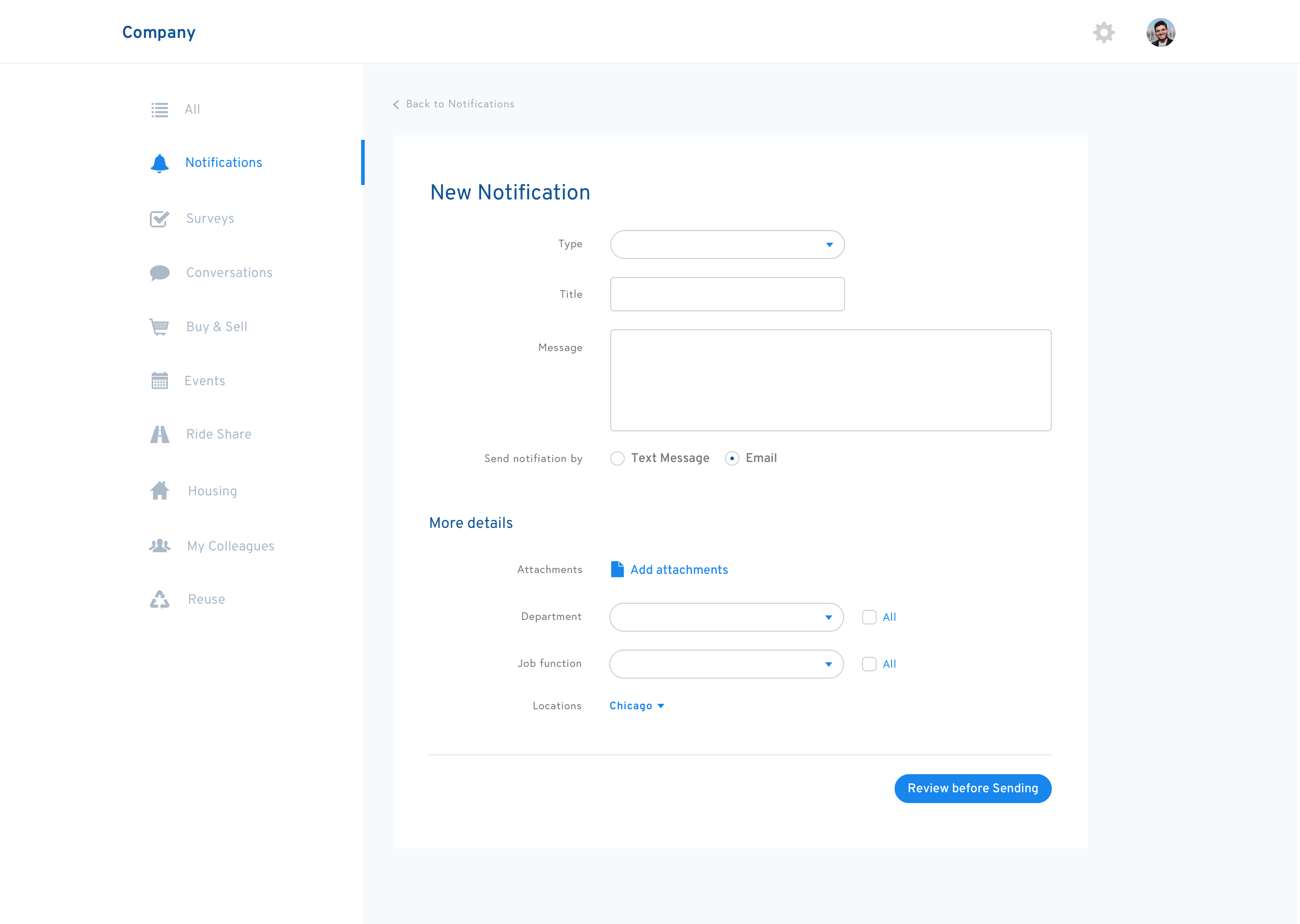
Many of my usability solutions were relatively straightforward. Here’s an example of applying fixes to a specific page, the form to add an event. If we could make the form easier to fill in, users would add more events to the system, helping OfficeAccord to achieve its mission of connecting employees.
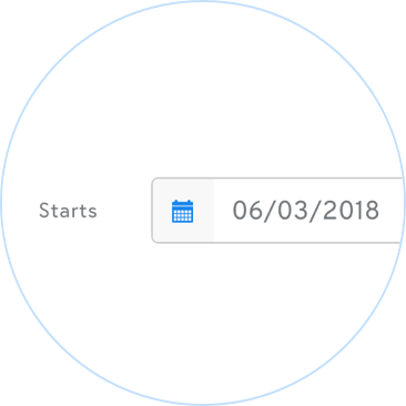
Adding a date now takes fewer clicks - and users aren’t forced to add an end time.
It’s now obvious that different departments can be selected - and users can still choose “all”.
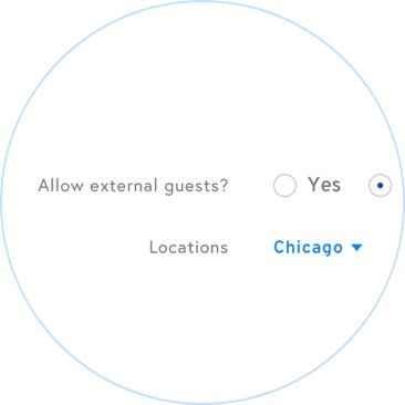
I simplified form labels and options to make them easier to understand.
It’s now easier to understand how to add and edit timeslots.
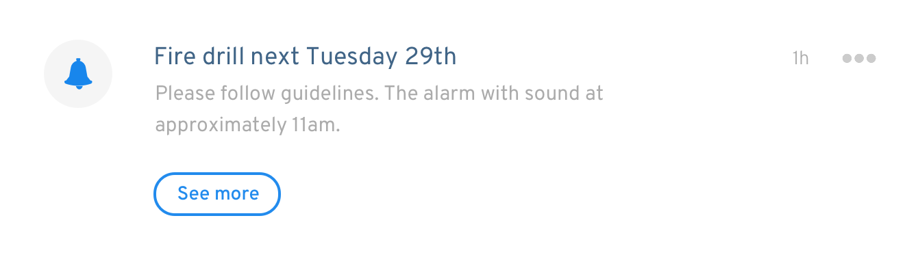
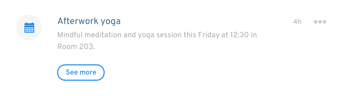
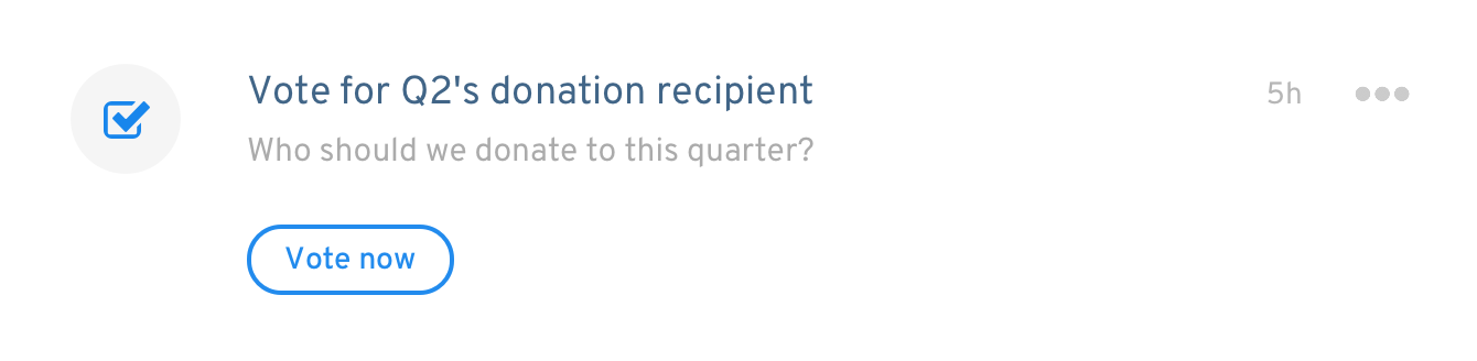
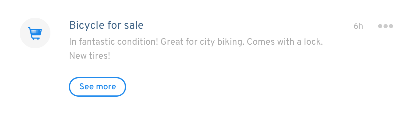
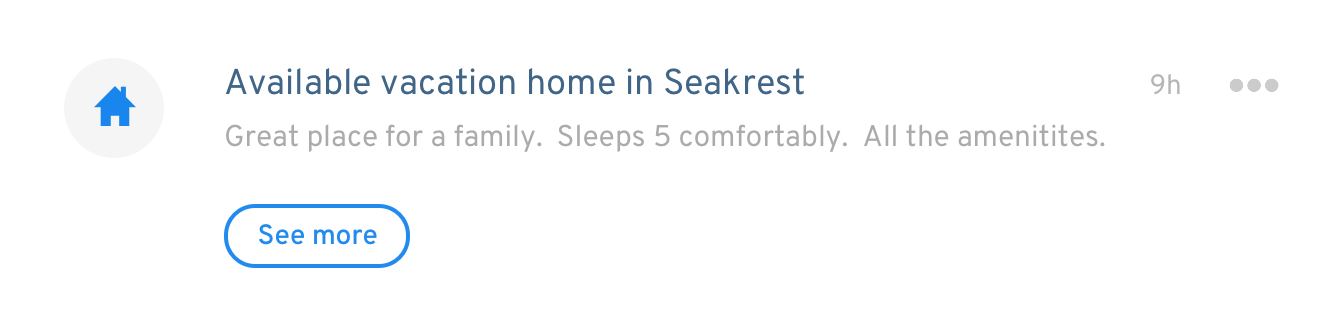
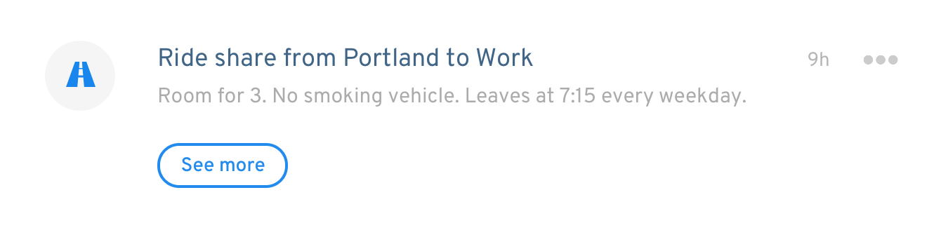
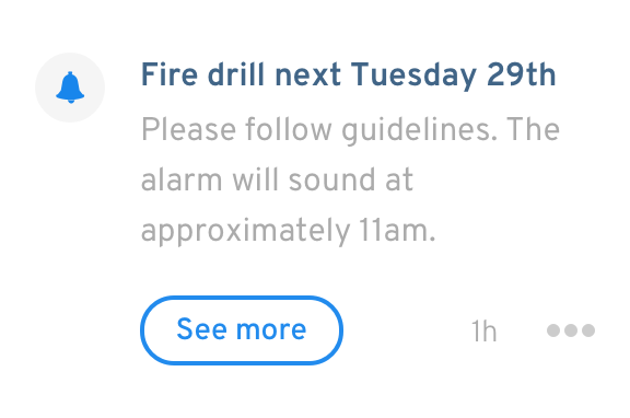
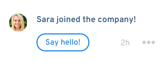
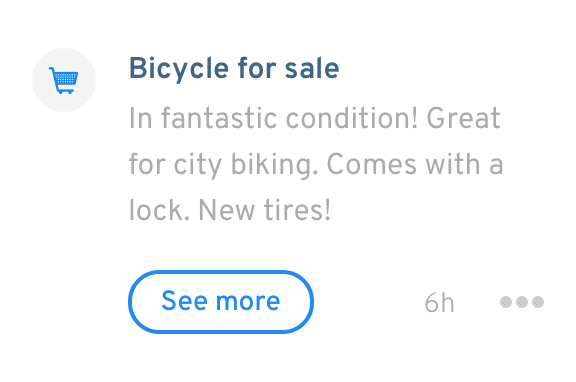
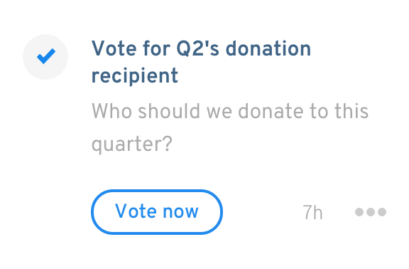
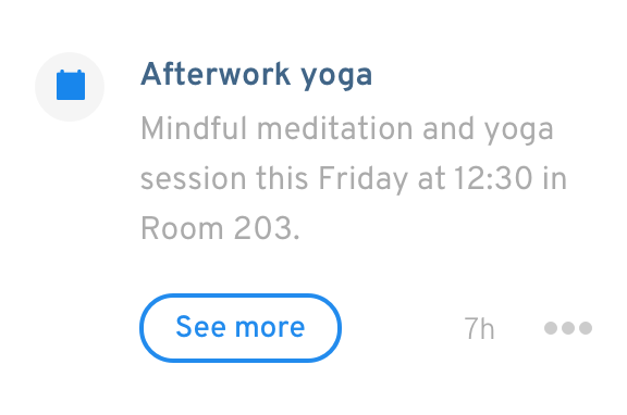
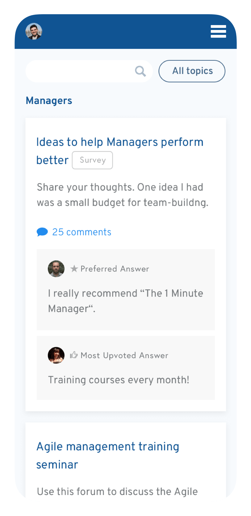
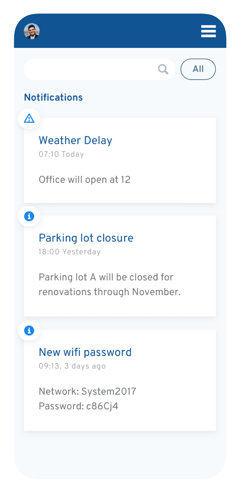
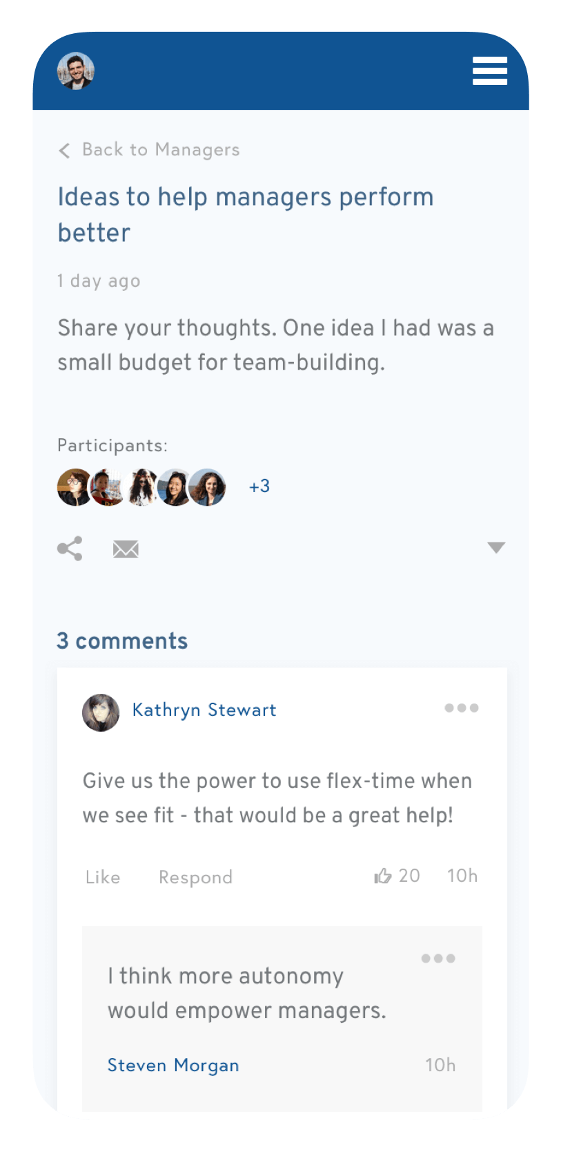
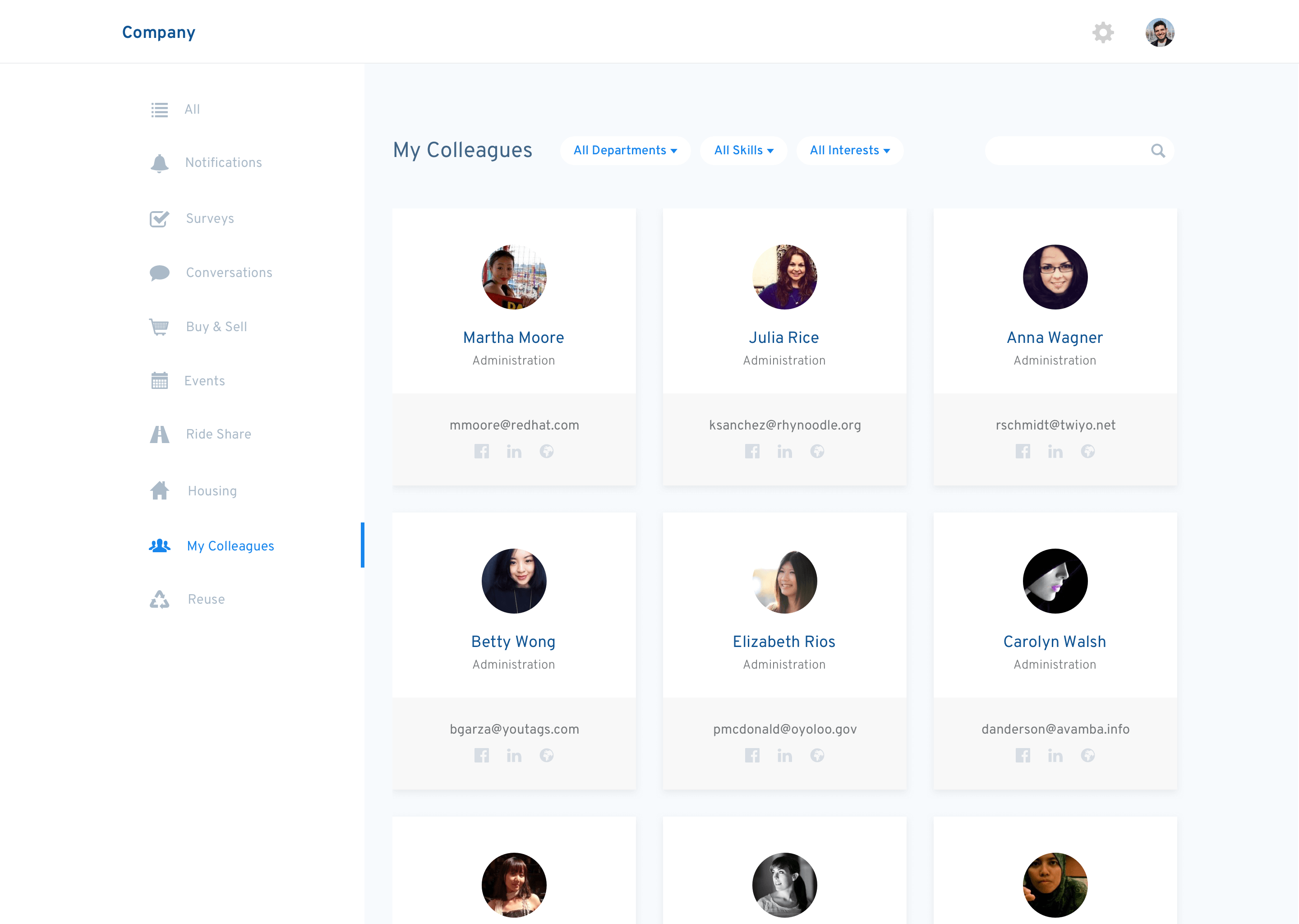
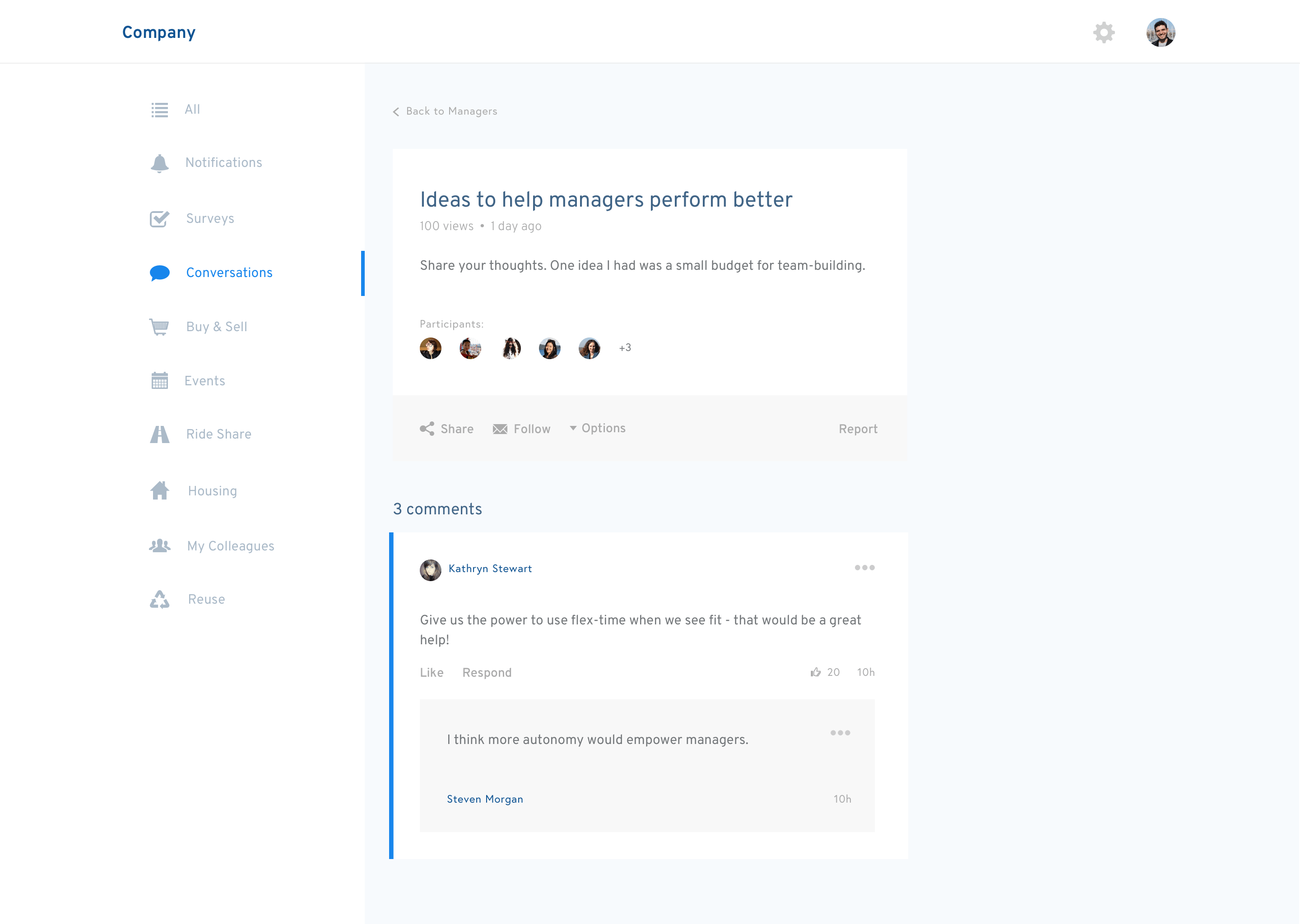
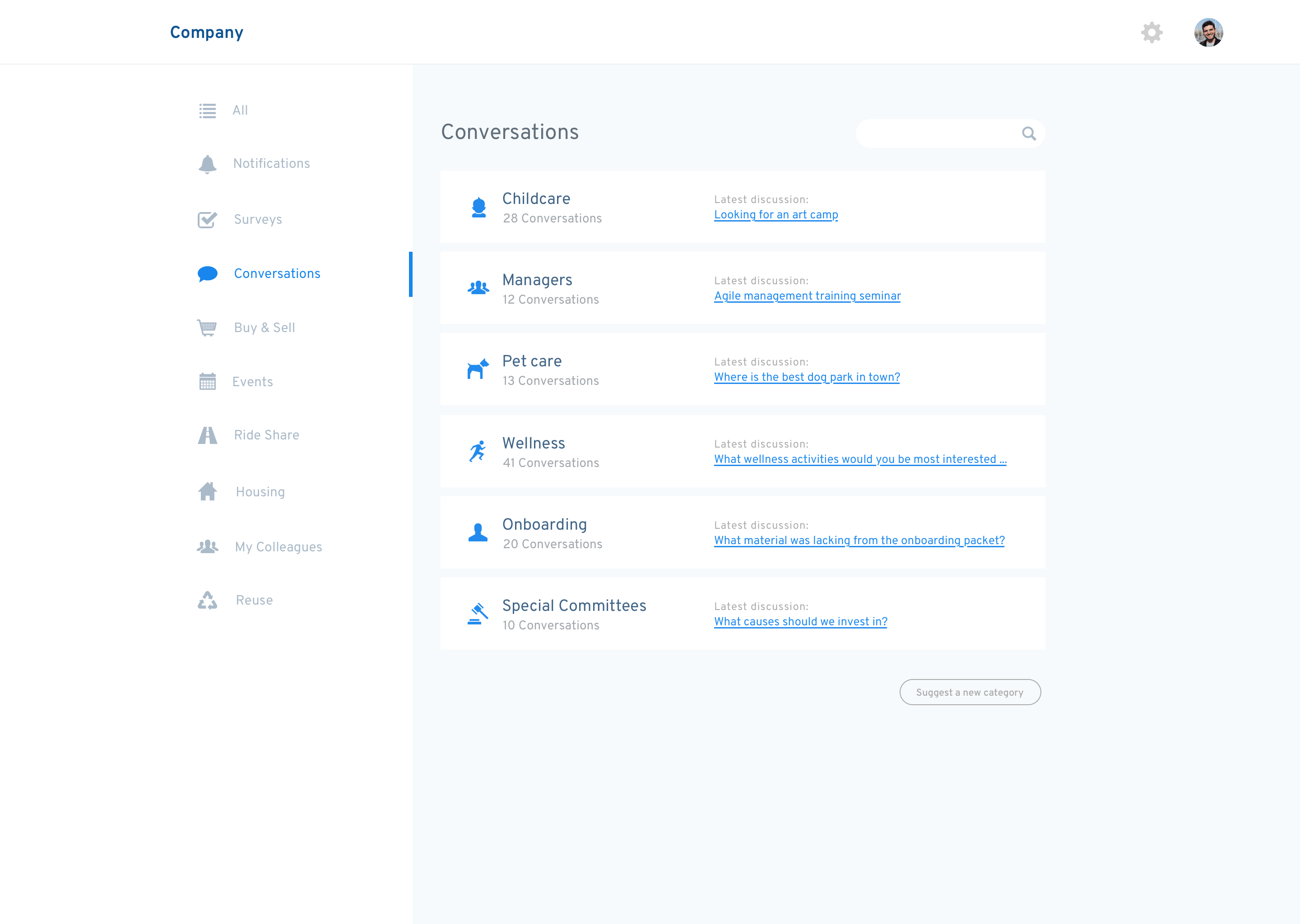
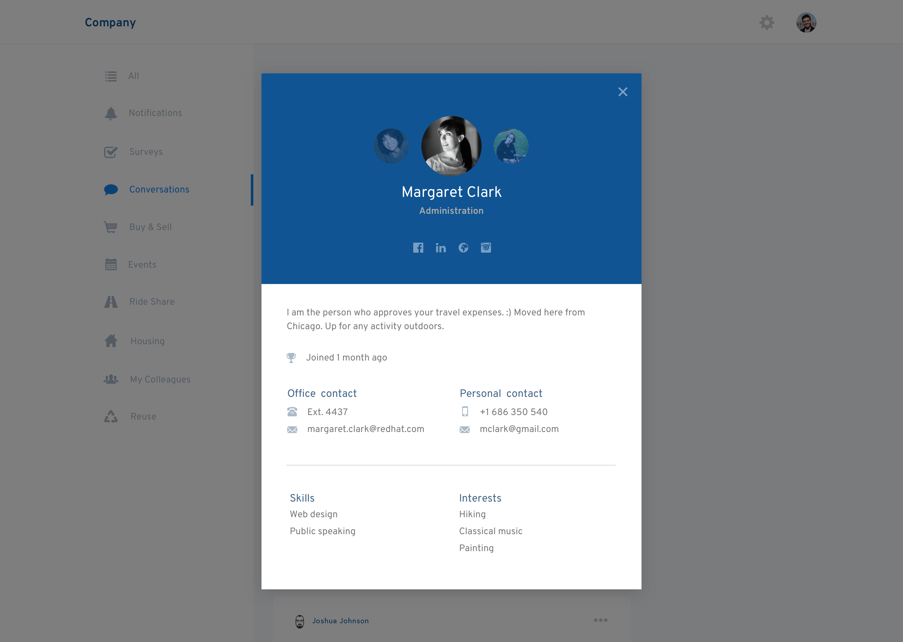
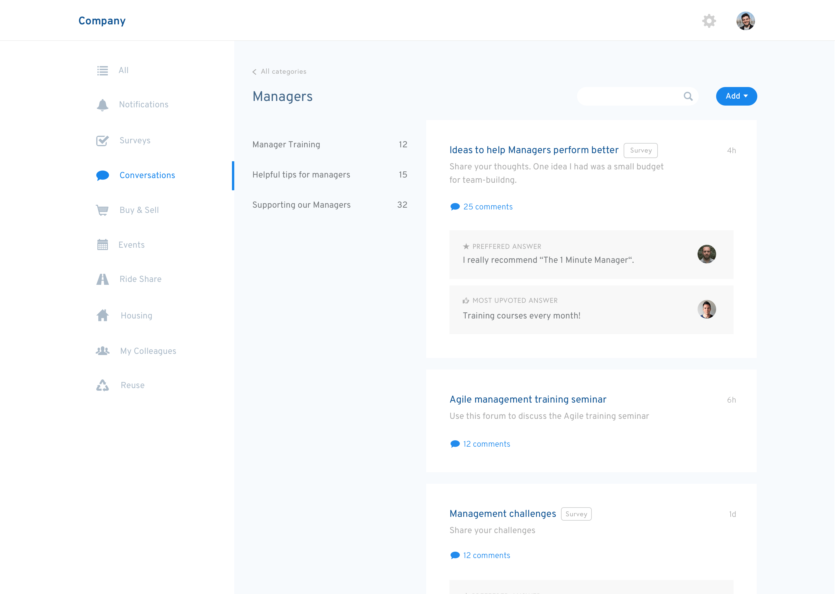
The OfficeAccord team wanted to consolidate all the product's data into one news feed - giving employees a quick run-down of important company news, surveys, job postings, as well as ways to connect with their colleagues through employee events, ride shares, etc.
The design for this view was critical - it needed to be simple and highly accessible but also account for different types of information.


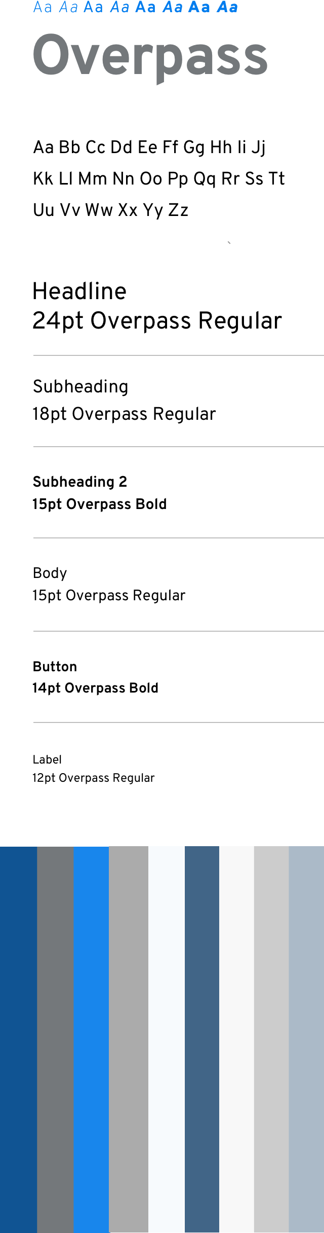
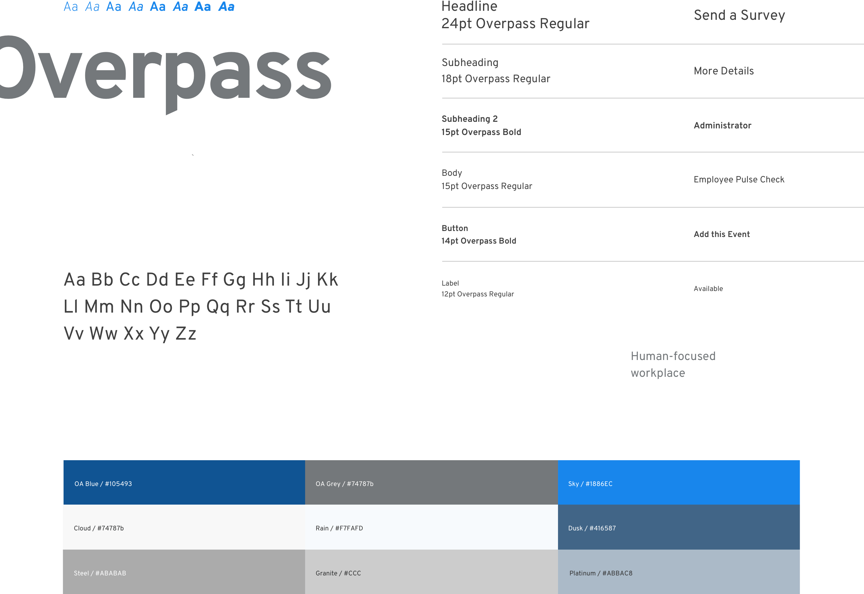
OfficeAccord, as a bootstrapped product, relied heavily on existing front-end libraries and frameworks. As a result, the interface was very generic and unattractive - and certainly not appealing to its enterprise-level clients.
I worked extensivly with OfficeAccord's leadership team exploring visual design directions. I eventually developed a muted colour palette to evoke a corporate, trustworthy feeling, and chose Overpass, a friendly yet neutral font.
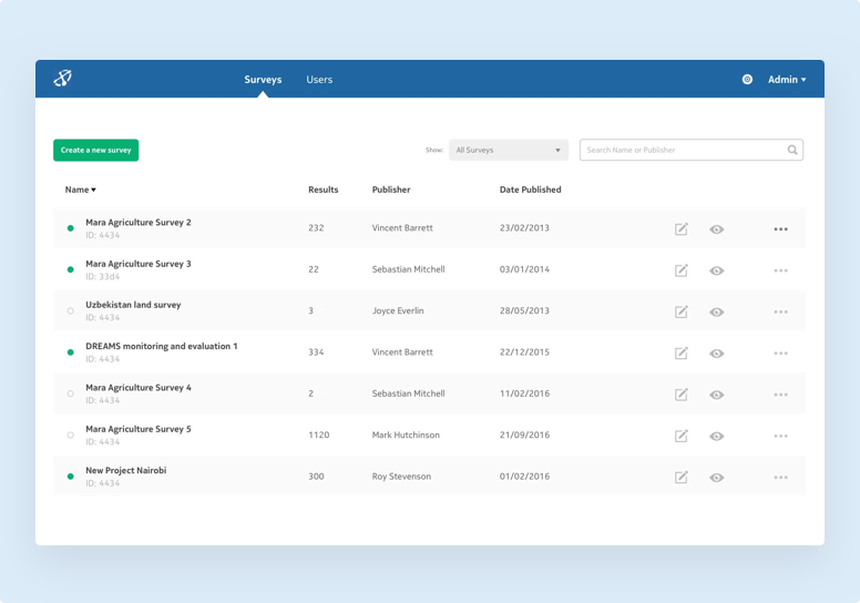
Working with Nokia, I redesigned a tool relied on by NGOs worldwide to gather and analyse data.
UX & Visual Design
Humanitarian software
An app designed to help patients get care in minutes, not days.
UX & Visual Design
Mobile health app